A 10 WEEK CASE STUDY
ABOUT CONVERSA
Leveraging AI and machine learning, Conversa creates personas and profiles individuals based on publicly available information such as social media, blogs and reviews. This provides users with recommendations on how to discuss work topics, tips on communication preferences, and adjustments to the written “tone of voice” to improve communication in the workplace.
PROJECT TIMELINE
10 Weeks
MY ROLE
UX Design
UI Design
TOOLS
Pen & Paper | Sketch | InVision
PLATFORM
IOS
THE CHALLENGE
How might we help workplace professionals better communicate and understand each other in order to build strong connections?
THE SOLUTION
THE PROCESS
Problem Space
Communication is important in every aspect of life, even more so in the workplace. It is vital for company productivity, fostering healthy collaboration and successful teamwork environments.
Verbal communication is complex. Many variables can affect it, including but not limited to language barriers and cultural differences. Successful written communication can be even harder to accomplish, as a lack of context, body language, or personal contact can further complicate communication.
With the focus of workplaces becoming more digital, remote work has increased cross-cultural interactions within workplaces while decreasing face to face talk. All this contributes to making internal communications crucial for success.
Project Goals
The ultimate goal is to improve communication at work.
Workplace communication is essential to teamwork, it builds and maintains relationships and facilitates innovation.
For companies, effective communication translates into better business performance and higher productivity. All while maintaining higher staff retention numbers and lowering costs associated with staff turnover.
How might we help workplace professionals better communicate and understand each other in order to build strong connections?
Research Methods
User Interviews
Persona
Experience Mapping
Usability Testing
User Interviews
Methods & Tools
Qualitative Research:
Interviews via video calls and in person.
Objectives
+ Get meaningful insights
+ Discover Pain-Points in workplace communication
+ Understand what the more usual misunderstanding are and why they take place.

Goal
Gather experiences and thoughts about miscommunication at work, in order to refute or confirm that it increases when they write to each other.
Criteria
+ Male / Female
25-35 Years old (Millenial)
+ Has working experience in a medium to large size company
+ Actively interact with colleagues and customers mainly through emails and instant messages
Research Insights
Misunderstandings at work are common (and frequent)
All the interviewees had experienced misunderstandings at work caused by different factors related to communication. They had many suggestions on how this could be reduced or improved.
Prolonged use of technology
Participants spend an average of 10 hours per day online.
According to them, their phone is the one item they can’t live without, followed by their computer.
Communication is important
100% of the interviewees described communication at work as important to extremely important.
Written communication is complex
Most interviewees experienced more misunderstandings via emails and chat than face to face.
GoalDifferent preferences on the communication channel
There were discrepancies regarding the communication channel of preference, but all of them utilize mainly written channels to communicate with customers and coworkers (emails and chat platforms).
Sharing is caring
Sharing information and knowledge seems to connect the team and assist them work toward the same goal. No sharing is perceived as a negative behaviour that impacts the whole team.
Chat platforms first
Most interviewees mentioned slack and other chat platforms as the most used form of communication between coworkers.
All day long (from home)
60% of the interviewees work full time Remotely.
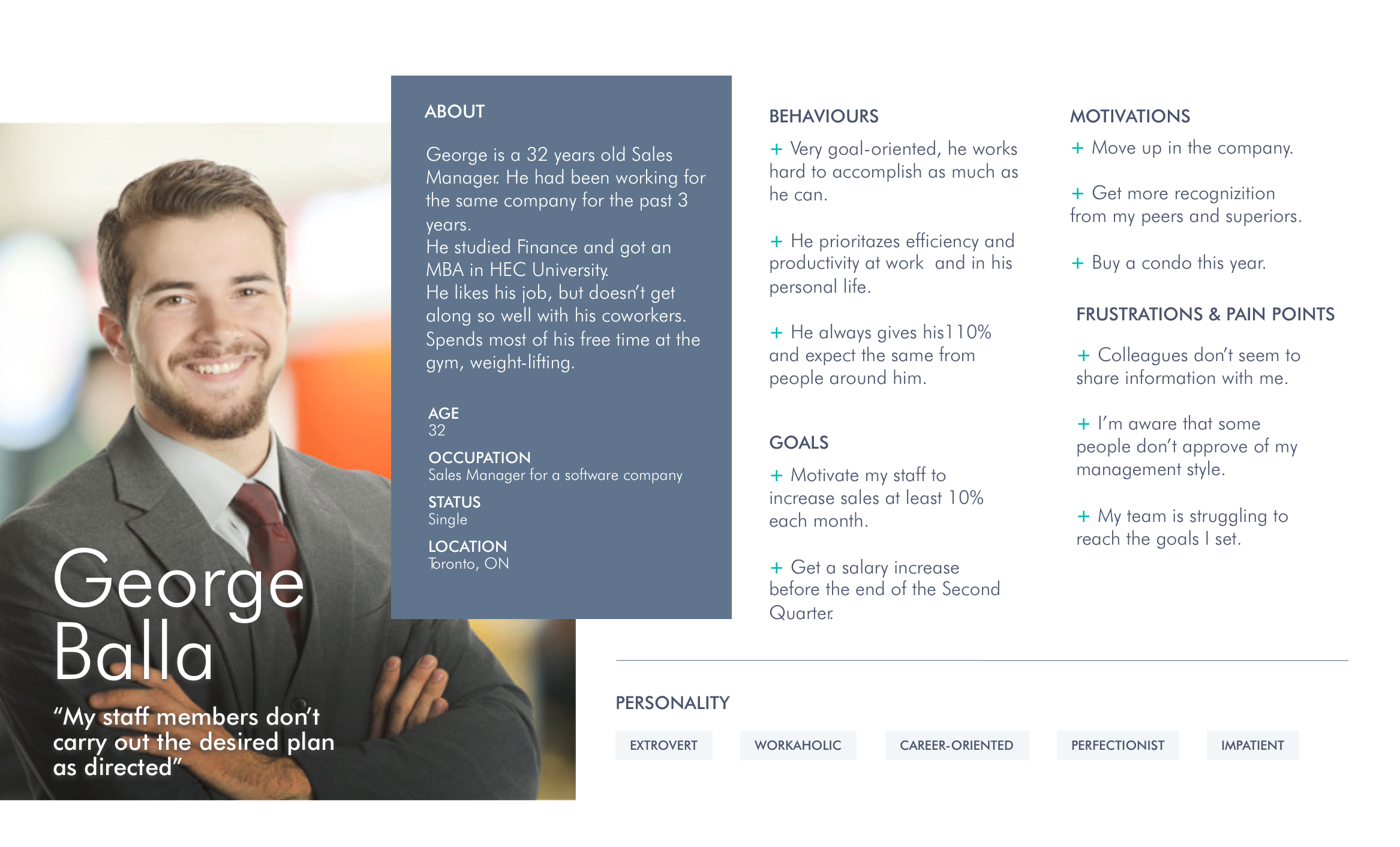
Persona
Based on the interviews, I created a persona representative of the user. George has been working as a Sales Manager for some time. He is a go-getter, but feels his coworkers don’t share information with him. It’s true that his team is not reaching their goals, but he is not aware that his communication style is coming across as too aggressive.
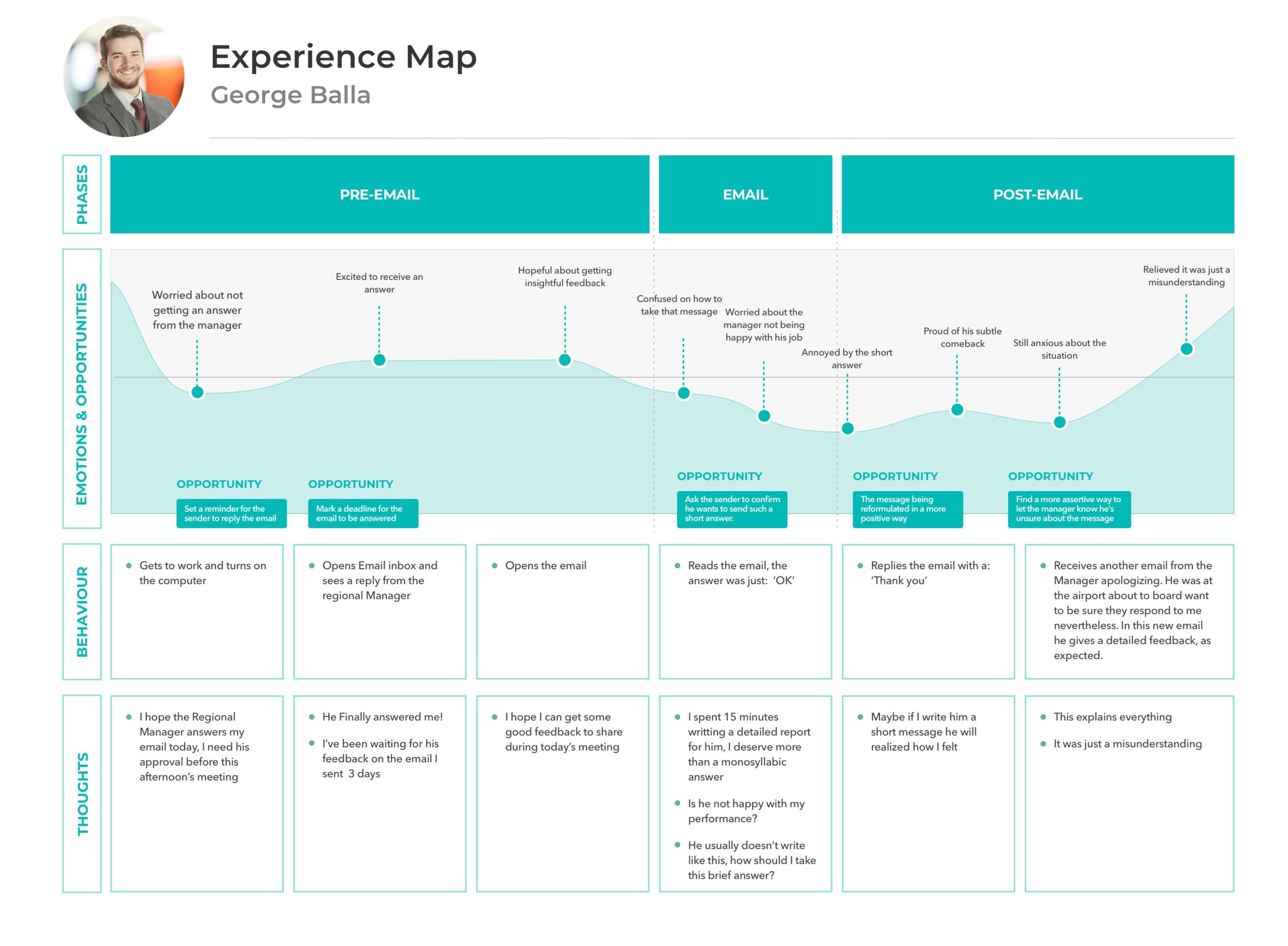
Experience Mapping
Based on the experience of some interviewees who received a monosyllabic answer after sending long and detailed messages.
This experience also represents the misunderstandings in written communication caused by the lack of context and tone.
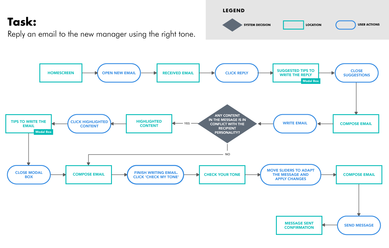
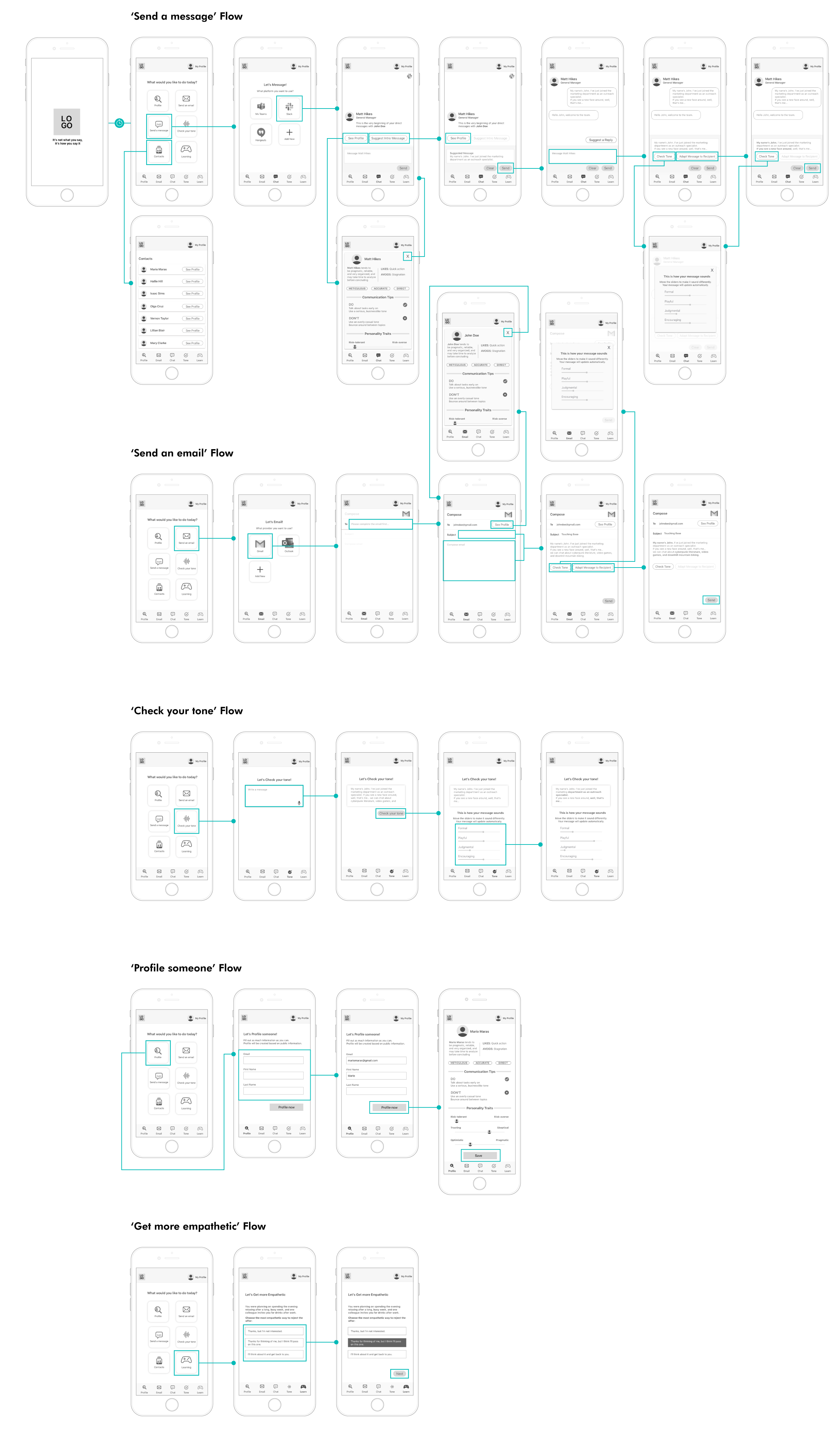
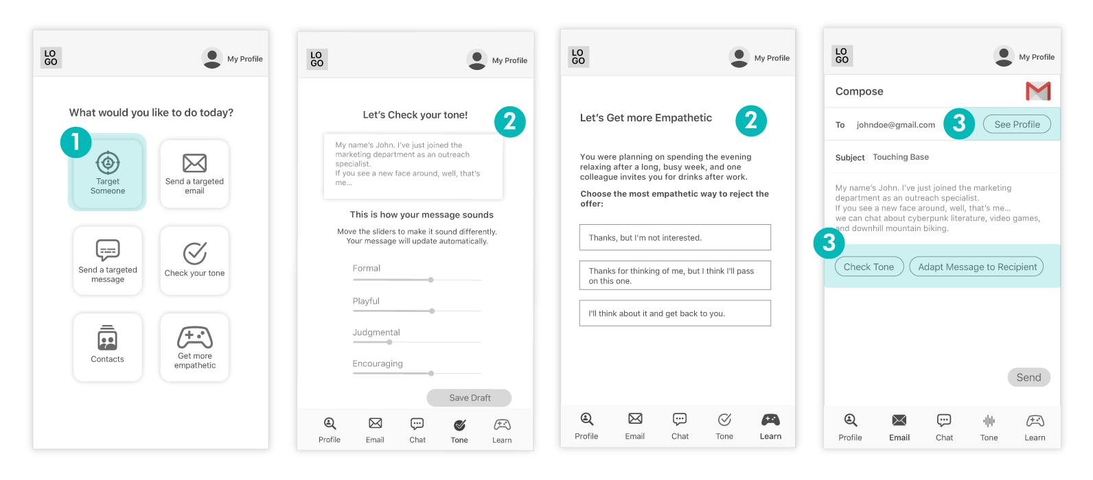
Taskflow
Sketches
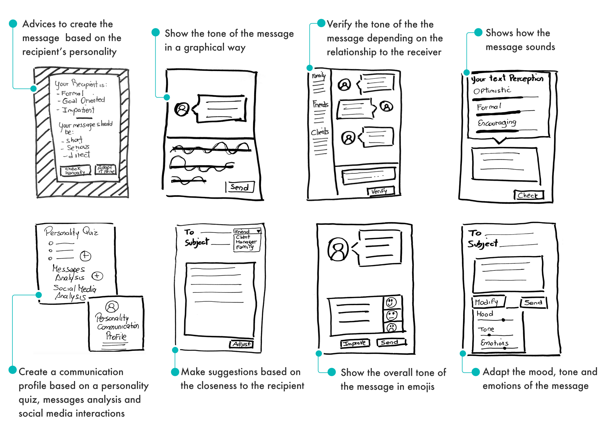
In the first sketches I explored different ways to show tone and emotions in written messages, and to adapt it to the recipient’s personality.
WIREFRAMING
Following the Human Interface Design for the iOS platform, I aimed for my prototypes to be simple and clean.
Usability Testing v1
In the first usability testing the main problems encountered was confusion from users, caused by the use of icons, and the way features were labeled. Multiple options with unclear actions were a major problem in the user journey. It was challenging trying to explain complex features in one to three words, especially when it’s new in the market (the user is not educated yet) or it does multiple tasks at once. Multiple options with unclear actions were a major problem in the user journey.
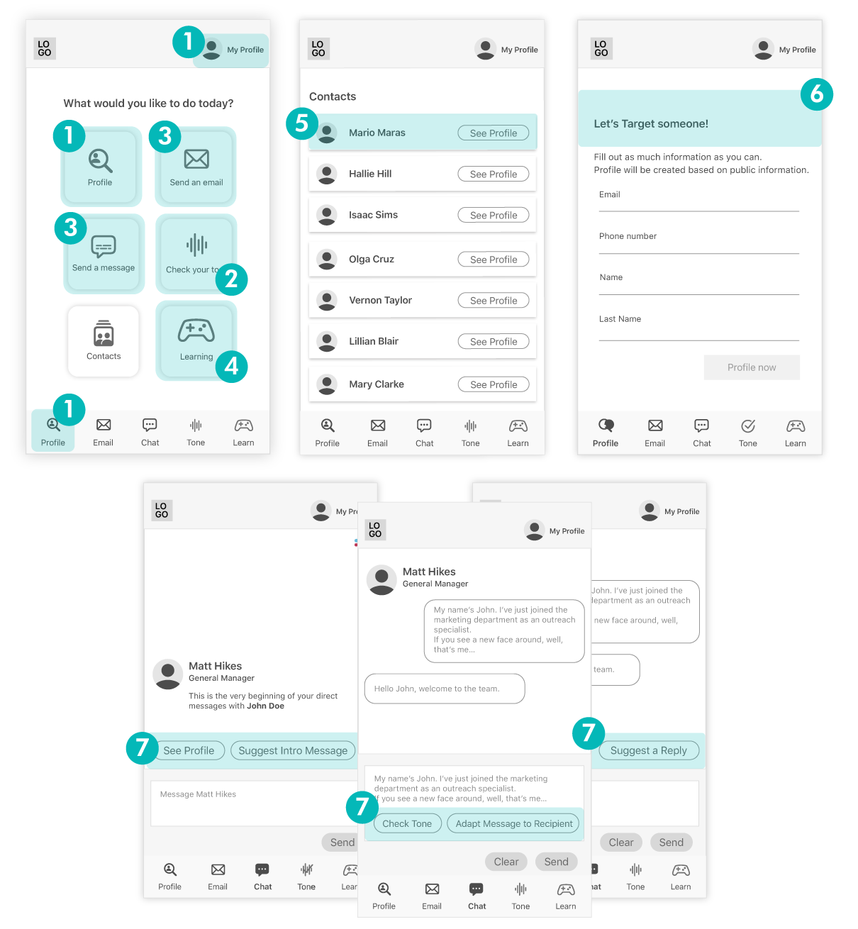
- Users thought the ‘profile’ option was their own profile, instead of an action to get information about other people.
- ‘Check your tone’ was perceived it as a feature related to voice (dictation or translation). The icon was strongly connected to audio waves.
- Why using the email and chat here instead of the native app? How is it different?
- Why is Learning a game? The game icon with the label ‘Learning’ was confusing for users, didn’t perceive it as a gamified feature at all.
- How might the system suggest how to address someone efficiently when contacts are not categorized and therefore the system doesn’t know the relationship between user and recipient.
- Where are they getting this information from?
- When sending a message, the presented call-to-action were unclear and the amount of options were overwhelming for the user

Usability Testing v2
Some of the issues I tried to solve after the first usability testing were still a problem, and new ones emerged.
This is how I modified in order to improve the usability of the app
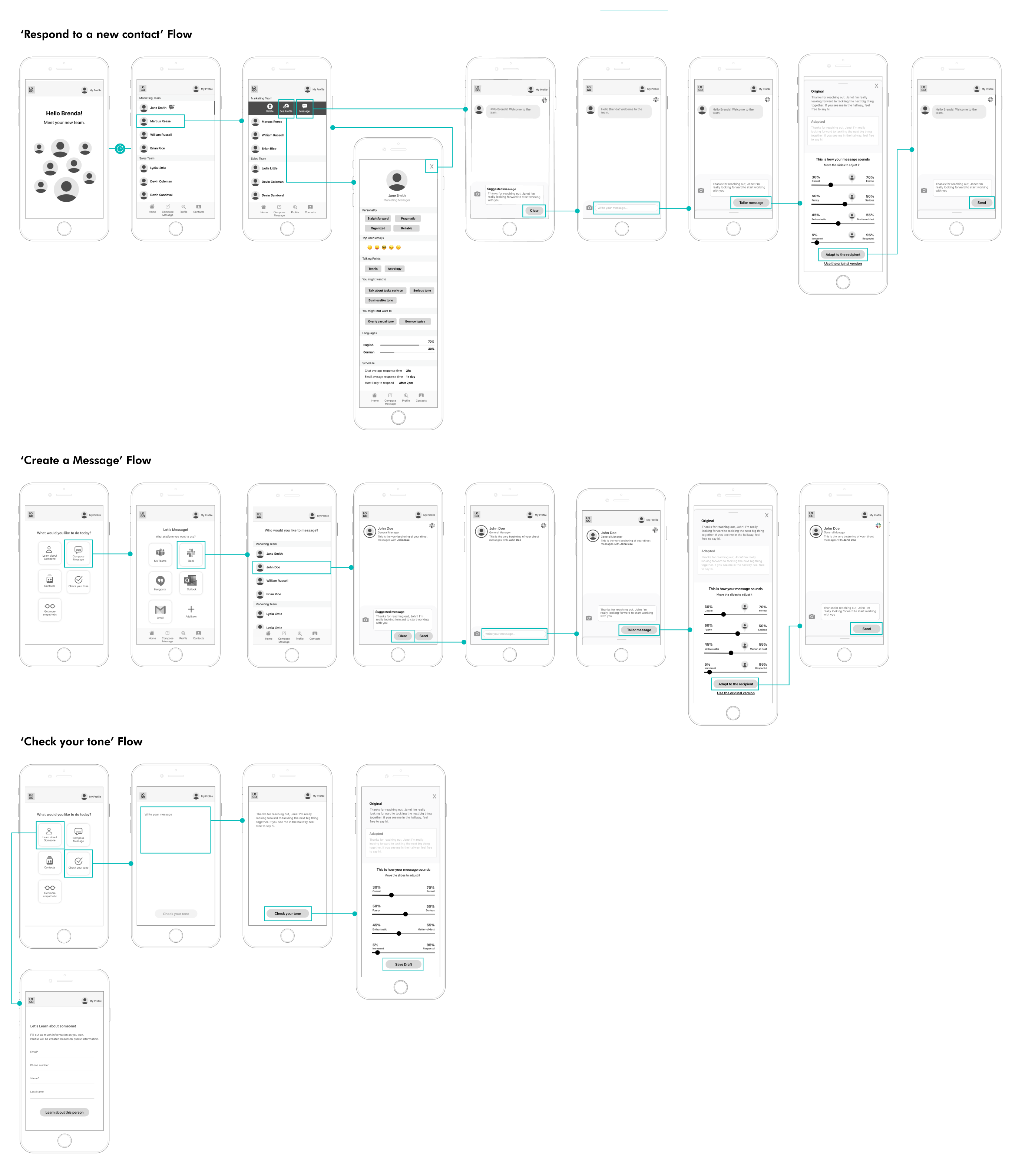
- ‘Target someone’ was described as ambiguous and perceived as negative, aggressive, even related to shooting someone.
- That’s cool! The game had a very positive feedback as well as the ‘check your tone’ feature.
- When sending an email, the user seemed overwhelmed by the amount of options available after writing the message. There was a lack of clarity on what the options were about.
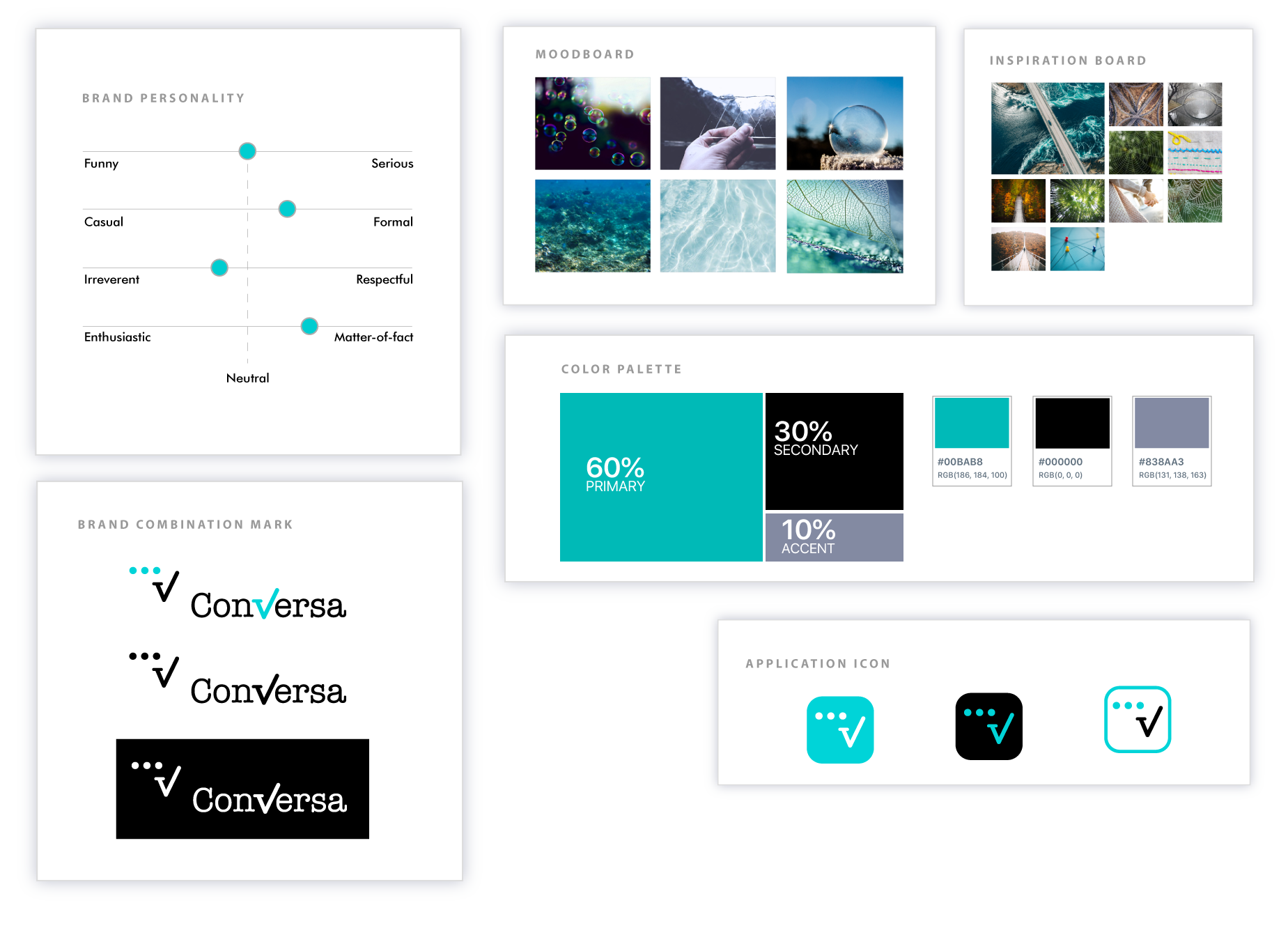
Visual Identity
Turquoise color suggests clarity of thought and communication. In the marketplace, turquoise is often found in brands centered on communication, including education, media, and computer technology. It is an ideal color for cleaning products as it evokes cleanliness and purity without being too sterile.
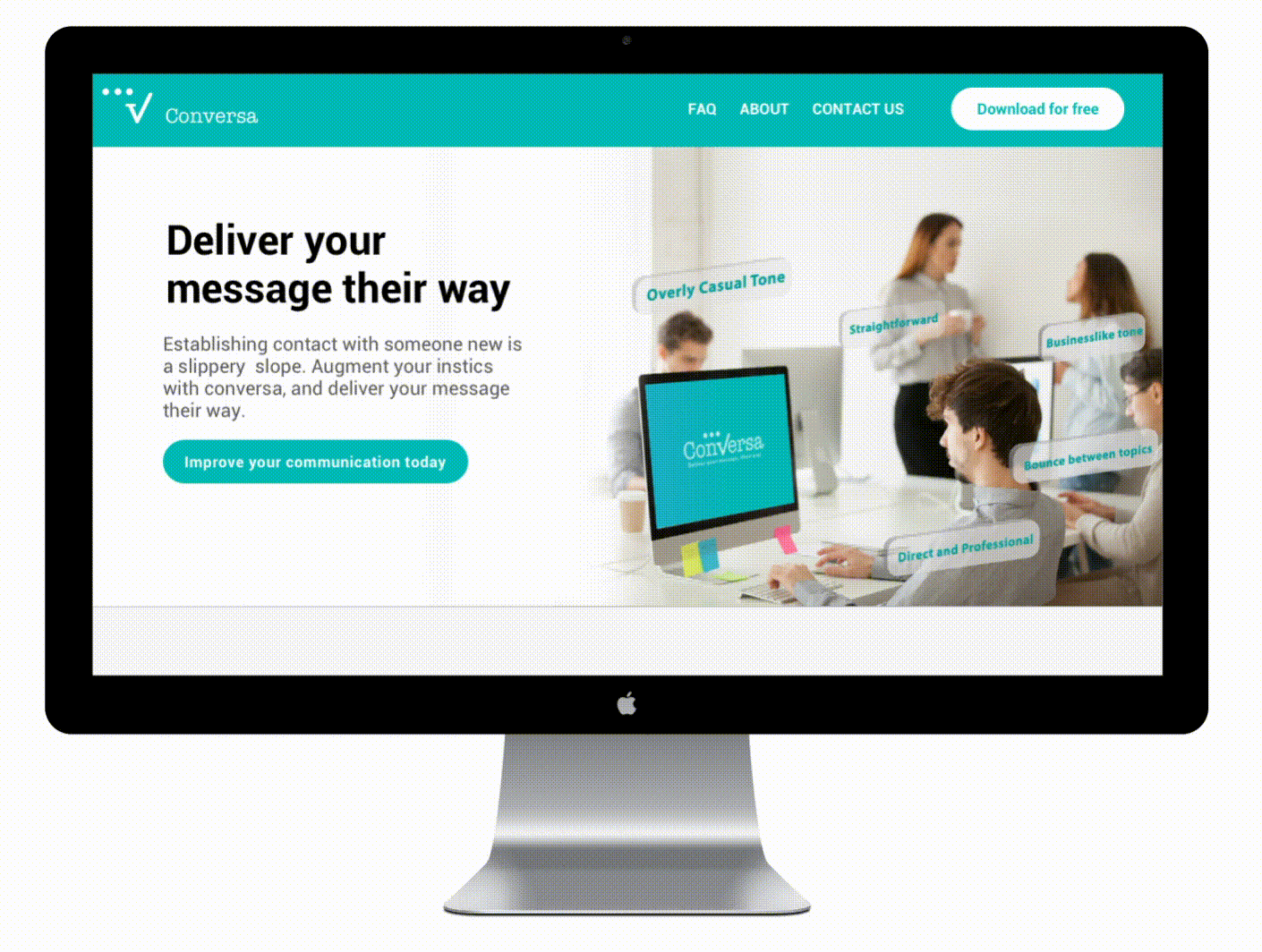
Marketing Website
The website is branded mainly by the turquoise and black palette.
The look and feel of the site is targeting professionals, and therefore I aim to make it look corporate but friendly at the same time.
As the app is about workplace communication and human relations, I decided it would be more effective to use photos instead of vector images or illustrations.
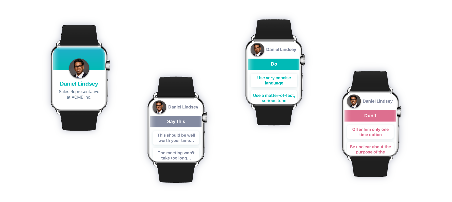
Multi Platform
The features in Conversa right there on your wrist could be helpful when meeting people in person, speaking on the phone, or if you’re curious about personality insights about someone you’re about to meet. This is why I envision it not only for mobile, but for the Apple Watch too.
Challenges
Icons and labels matter
The main challenges were related to icons, feature labeling and making the flow intuitive.
It was challenging trying to explain complex features in one to three words, especially when it’s new in the market (the user is not educated yet) or it does multiple tasks at once. One example was what in the final version was ‘see someone’s personality’ but in the previous 2 iterations ‘target someone’ and ‘profile someone’ was either not understood or perceived as negative. Multiple options with unclear actions were a major problem in the user journey.
Making it intuitive
With nothing currently on the market to compare to, it took many iterations to help people understand app functions without depending on the pre-boarding screens.
Design Impact & Future Thinking
Conversa has the power to change the way people communicate while reducing the amount of misunderstandings and helping people achieve more effective communication. For companies, effective communication translates into better business performance and higher productivity, all while maintaining higher staff retention numbers and lowering costs associated with staff turnover.
The main goal of Conversa is to improve communication, and a key part of it is learning. For the future, the plan is to create a learning feature, describing different scenarios where people can test their responses and become more empathetic with practice.