
A 3 WEEK CASE STUDY
BACKGROUND
A report by Quebec’s health and welfare commissioner says the province has the worst emergency room wait times in the western world.
The report found that 1.5 million emergency room visits surpassed the Health Department’s maximum wait time in 2017-2018, amounting to 13 million extra hours spent waiting for care.
PROJECT TIMELINE
3 Weeks
MY ROLE
UX Research
UX Design
UI Design
TOOLS
Pen & Paper | Sketch | InVision
PLATFORM
iOS
Problem Space
Emergency Rooms in Quebec
The Very Worst Wait Times in Canada: Quebec
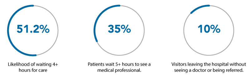
A study by the Canadian Institute of Health Information and the Commonwealth Fund compared ER wait times in 11 countries with access to universal healthcare and revealed that Canada didn’t just rank low, it was literally the worst. The Very Worst Wait Times in Canada: Quebec
1.5 million emergency room visits in Quebec exceeded the province’s maximum wait time, totalling about 13 million hours of wasted time for Quebecers. According to the Montreal Gazette, all of those hours lost waiting around account for about $300 million in lost wages.
Project Goals
The ultimate goal is to build an interactive digital solution that improves healthcare for patients. In order to so, I will conduct primary research to understand how people manage their health through existing healthcare services.This will allow me to gain insights into the target user’s frustrations, pain points, motivations, and goals, which will define the functionality of the solution.
Before conducting research, my assumptions are as follows:
- ER waits in Quebec are beyond excessive.
- People hate waiting but there are no alternatives.
- There’s room for improvement in this area.
Research Methods
User Interviews
Persona
Experience Mapping
Usability Testing
User Interviews
Methods & Tools
Qualitative Research:
Interviews via video calls and in person
Objectives
+ Gather experiences and thoughts about the healthcare system in Quebec
+ Discover user’s frustrations, pain points, motivations, and goals during ER visits
+ Understand common misunderstandings and why they take place.
Goal
Understanding patient experiences, and how people manage their health through existing healthcare services and resources.
Criteria
+ Male / Female
+ 25-55 Years old
+ Currently living in Canada
+ Had been an ER patient in the province of Quebec within the last 3 years
Interview Guide
Basics
+ Gender
+ What’s your name?
+ How old are you?
+ What is your marital status?
+ In what neighbourhood do you live?
+ How long have you lived there?
+ Who do you live with?
+ Tell me a little about your history
Work
+ Could you please describe your career path.
+ What is your current occupation?
+ What is your annual income?
Daily Activities
+ What do you like to do for fun?
+ What does a typical busy day look like for you?
Deep Dive
+ Name one item you can’t live without. Why?
+ What would you like to change / improve?
+ How do you usually get around the city?
+ How would your closest friends describe you?
+ How much time do you spend online?
+ What do you use internet for, the most?
+ What’s your Favourite quote?
+ What motivates you when you wake up in the morning?
Reflection
+ Was there anything that could have made your experience in the ER more pleasant?
+ What are your thoughts about your overall experience?
+ How do you feel about having to go back to the ER?
+ Anything else you would like to add?
Specific Questions
+ Please take me back to the last time you went to the ER as a patient in Quebec?
+ How long did you wait since you presented symptoms until you went to the ER? Why did you wait?
+ Do you remember when exactly did you go?
+ How long did you spend in the ER?
+ What was the most tedious part?
+ What did you do during the waiting time?
+ Where did you wait?
+ How did you feel during the waiting?
+ Could you please describe the waiting room?
+ What was your diagnosis?
+ What about the follow up?
Interview Findings
When going to the ER, every respondent said the most tedious part was waiting.
All of them waited, between 1 day and 2 weeks, as they waited to got to the ER, hoping that symptoms would improve before going.
100% of the interviewees chose the hospital based on their location.
Among the interviewees, they all experienced a 4+ hour wait.
A large percentage of the interviewed people experienced negative feelings during the waiting period: anxiousness, frustration and annoyance.
75% felt the hospital was short-staffed.
How might we reduce the waiting time in the Emergency Room?
Persona
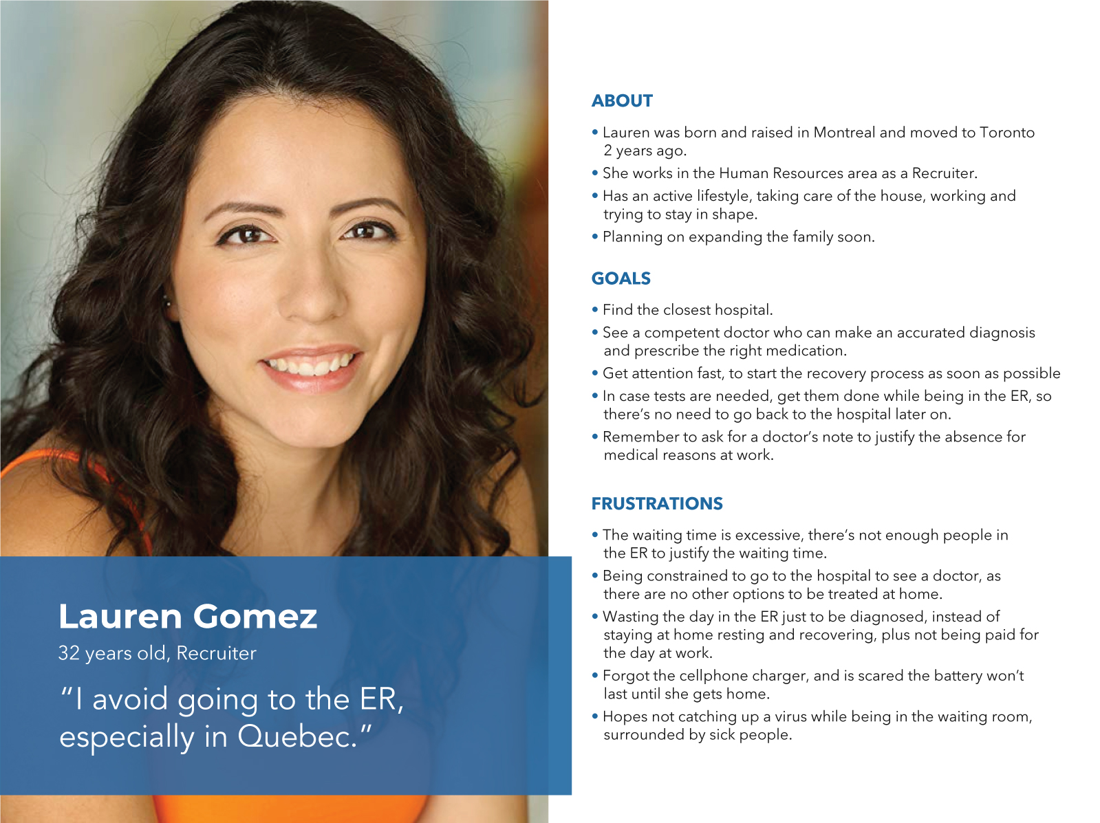
I’ve created a persona based on the insights I gathered from the group of participants I interviewed.
Experience Mapping
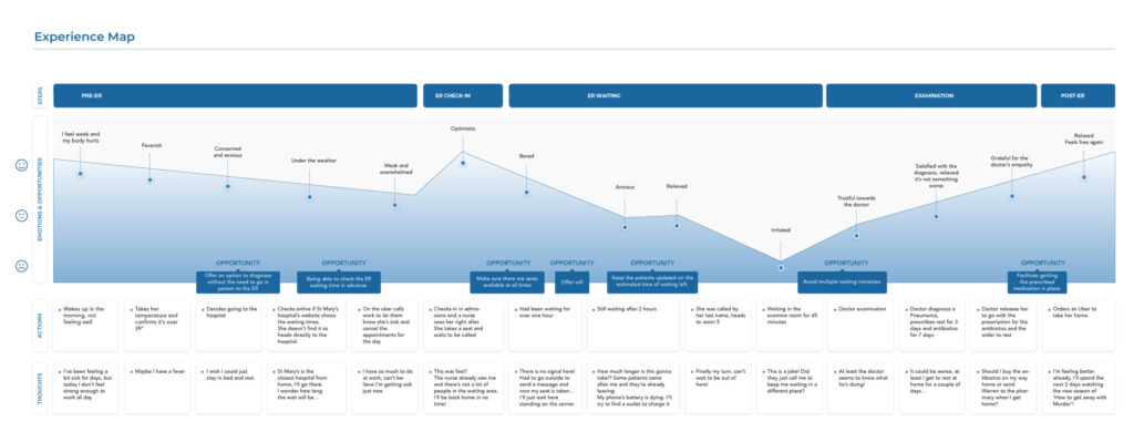
Based on the experience on the patterns found in the user research phase, I built a visual map to represent a visit to the ER in order to find pain points and opportunities.
User Stories
I created a set of user stories that capture the functional needs of my persona, and reflect specific features and desired functionality users might expect from a digital solution.
As a patient, I want to see a doctor via videocall, So that I get diagnosed expeditiously from home.
+ As a patient, I want to search for walk-in clinics currently accepting patients, So that I can go to a clinic instead of a hospital.
+ As a patient, I want to know the waiting times of the Emergency Rooms in my area, So that I go to the one with less waiting time.
+ As a patient, I want to save a spot in the ER from my phone, So that I can rest at home until my turn comes
Taskflow
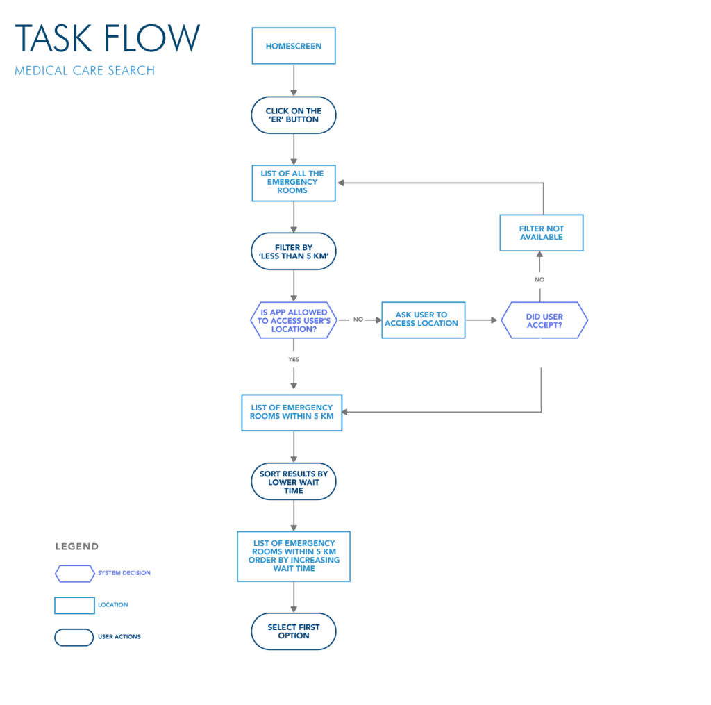
I translated one of the user stories into a task, and created a task flow diagram that visually depicts the user flow logic involved in completing the chosen task: Search for urgent medical care.
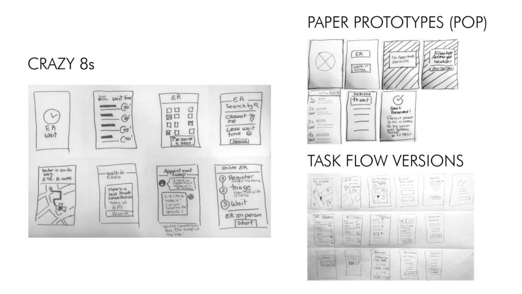
Sketches
In my initial sketches, I tried to find different ways to translate some of the user stories into product functionalities, by exploring different concepts and represent them visually.
Wireframing
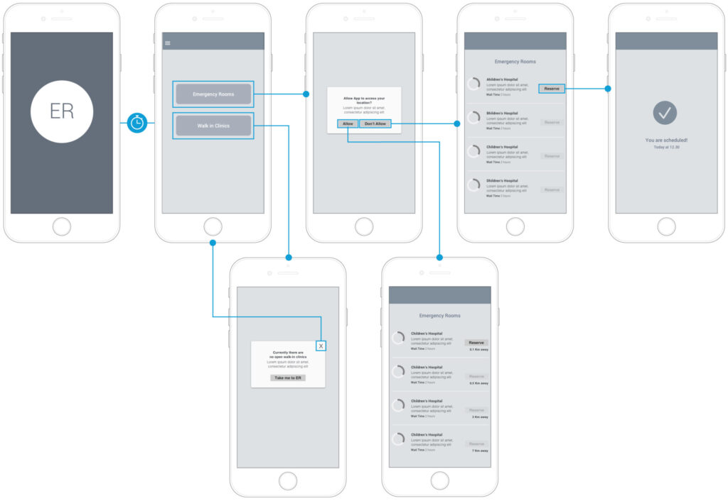
After selecting the most compelling sketches I translated them into wireframes that will create the groundwork to get to the prototyping phase.
Wireframes v1
In the first wireframes the happy path is scheduling an appointment to see a doctor, there is a secondary task leading to a ‘no open walk-in clinic’ alert.
Usability Results V1
Based on the feedback from the first round of user testing, these are the main pain points I found and how I solved them.
SPLASH SCREEN
Users were taping outside the logo hotspot. To solve this, I made the whole screen a hotspot.
ER RESERVATION IS NOT POSSIBLE… YET
With the current technology, it’s not possible to reserve a place in Emergency Rooms. And users pointed this out several times.
I translated the reservation process for walk-in clinics.
THE ER CAPACITY GRAPH
Users didn’t understand what the graph was about, so I added a label underneath for clarification. (e.g. 50% capacity)
DIRECTIONS TO DESTINATION
I added a ‘show directions’ button (next to the distance description) to take full advantage of the location access, and make it easier for the sick user.
Wireframes V2
In the second version of the wireframes, I added a second task and found solutions for the problems arised during the usability testing.


Usability Results V2
Based on the feedback from the second round of user testing, these are the main pain points I found and how I solved them.
EAGER FOR MORE INFORMATION
User expressed they would like to see more information about the hospitals and walk-in clinics, like reading the reviews, specialties and phone number.
FILTER AND SORTING
Most users communicated they would appreciate to have filters to organize their search by rating, location and time wait.
DIRECTIONS IN GOOGLE MAPS
Showing the directions to access the ER (leaving the app and opening Google Maps) felt like a detached experience.
CAPACITY GRAPH… IN WALK-IN CLINICS
After having seen the Capacity Graph in the ER Flow, they said in the walk-in clinics it could be useful, even when they had an appointment scheduled.
LOG IN
Some users were questioning if they were signed up already, as no credentials were asked at any point. A login or welcome screen, when opening the app might solve this issue.
Challenges and Next Steps
During the research stage, I confirmed my hypothesis, that the main pain point when sick (apart from being sick) is the waiting. While 100% of the interviewees experienced excessive wait times in Quebec, some had the chance to compare the health system with other provinces, and stated that the wait times in Ontario are notably less.
If I had more time, I would have enjoyed exploring into ER reservation development process. The flow would begin with online registration: sending a health card photo and completing a form, followed by a video call with a nurse, who can assess the urgency and assign a number, finally the patient can wait online (reducing the risk to catch a virus in the waiting room, and resting at home while waiting), tracking the status and getting a notification 30 minutes (or more) prior to the appointment.
For the next iteration, I would add a sign up process and provide more information for users to make a more informed decision, such as ratings and reviews, which seem to be key.
