SECOND CUP REWARDS HEURISTIC EVALUATION
Following the Neilsen Norman Group’s 10 Usability heuristics, I will analyzed a highly rated app. In this evaluation I:
1- Assessed usability and functionality of the app using the above hueristics.
2- Proposed redesigns based on my findings.
3- Created a scalable user interface (does not need to be capitalized, but you can do UI in parenthesis because now you’ve established what UI Library means)
PROJECT TIMELINE
2 Weeks
MY ROLE
Evaluator
UI Designer
TOOLS
Pen & Paper | Sketch | InVision
PLATFORM
iOS
About Second Cup Rewards App
The Second Cup Coffee Co. app provides members with an easy and fast way to earn rewards with every purchase. It’s an important program within the company, and it continues to grow, representing a quarter of sales in Q4 2018.
I analyzed the iOS platform. In the Apple Store the app is highly rated: 4.5/5 based on 4.7k reviews, which will a fairly big challenge.
The Project
My team and I evaluated the existing app’s usability using Neilsen Norman Group’s 10 usability heuristics. This allowed us to have a standardized way to assess usability and functionality.
The task
Find out what smoothie flavours are available and the price for each size.

HEURISTIC EVALUATION
Following the previously stated task flow, we evaluated the extent to which the screens adhered to standards.

Match between system and the real world
How it works’ screen
A vague explanation, especially if the user is a first time customer. Also, there’s high cognitive load making the user calculate the value of the points: “Earn 10 points for every dollar spent, and get a reward every 500 points earned” Finally, it is not clear what kind of reward they get. Giving examples of what this reward is would be easier to understand than just numbers and points.
User Control and Freedom
- Once users finish order customization, they are redirected back to the Beverage Menu. The user should be empowered to decide to keep browsing or to add more.
- During the checkout process there is no option to change the pickup location. If the user wants to modify it, they have to start the order over again.
Consistency and Standards
There are several inconsistencies in the different screens:
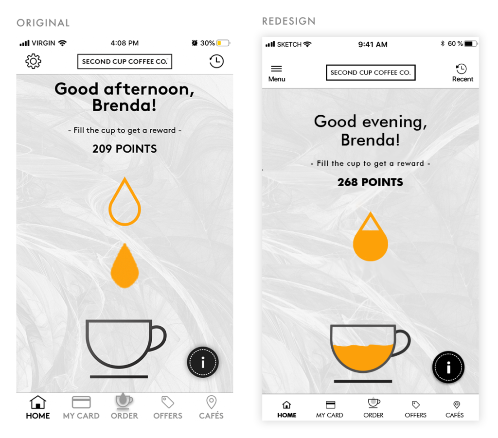
- In the main navigation menu, the gear icon is used to represent ‘menu’ when it’s usually used for settings. This in inconsistent with iOS standards and within the internal information architecture. There are several screens where the option is non-existent.
- The icons in the footer menu are not consistent with Apple’s Human Interface guidelines, which states an ideal size for the icons of 36px. Even when the icons are within the maximum width of 44px, they don’t adhere to the 20px padding around, there is a clear lack of white space in the section.
- In the ‘Privacy Statement’ screen, there are 3 different menus, one below the other: we find the gear (representing the main menu throughout the app), a burger menu (just shown in this screen) and a third non-contextual submenu.
Error Prevention
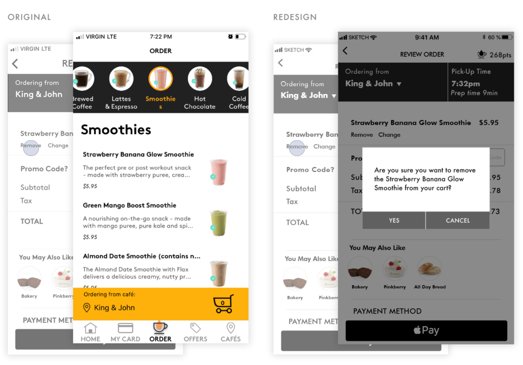
- There is no confirmation step to remove an item from the cart or any option to undo the action in case it was removed by error.
Flexibility and Efficiency of Use
- In the order menu, There is no search bar. With so many options, specific searches and filters would result in a more efficient process.
Aesthetic and Minimalist Design
- The wallet screen options do not appear designed for iOS, creating an additional step.
- In the Menu screen, the unharmonious colour and arrangement of elements creates unnecessary cognitive load. Furthermore, the ‘My Orders” background colour is not found anywhere else in app.
- The ‘Order pick-up location’ bar occupies 30% of the screen reducing the real estate for the main content: menu items.
Help users recognize, diagnose, and recover from errors
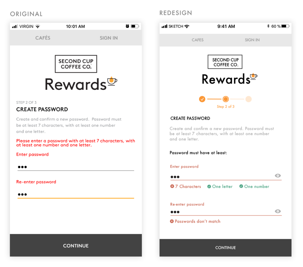
- During the registration process, if there is an error while trying to create a password, no feedback is given on what criteria is not being met.
- In one edge case, re-installing the app after not using it for years gave no recovery password options other than an email address. This response was never received, preventing a potential user from accessing the app at all.
Usability Score
Overall Score
4/5 Major usability problem
Although, the interface presents mostly cosmetic problems and most of the functionality works, the app shows a Major usability problem during password recovering, that might potentially prevent the user to access the app altogether.
SCREEN REDESIGN
In the first wireframes the happy path is scheduling an appointment to see a doctor, there is a secondary task leading to a ‘no open walk-in clinic’ alert.
Registration
In the redesign, instead of a generic error message users are informed exactly what criteria is not being met.
Also added:
– the option to show the password
– Steps to show where the user is in the registration process to reduce drop off.
Main Screen
Switched from the gear icon to a burger menu with an added description. It is now clear what this interaction is and will do.
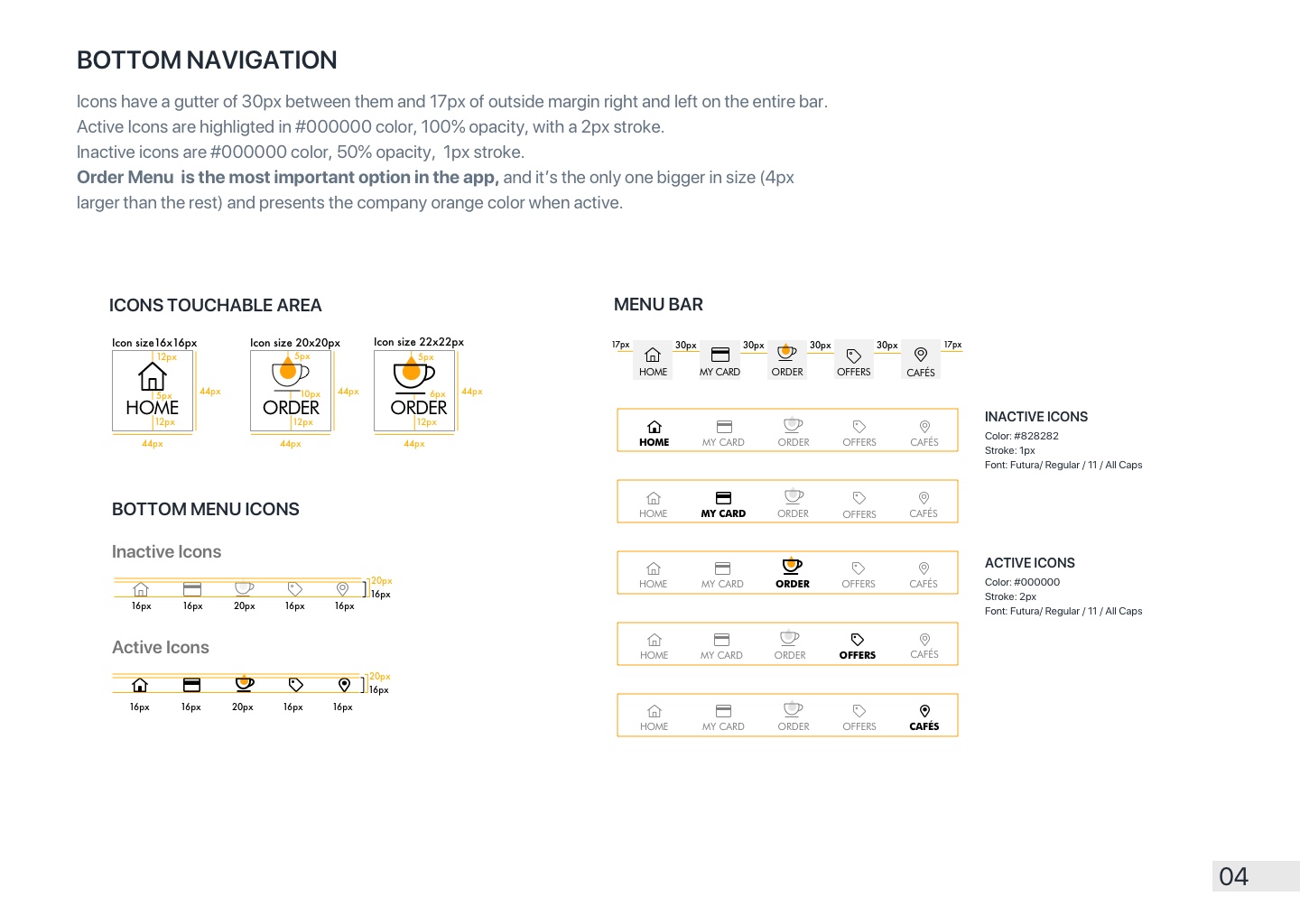
Icons were reduced to human interface guidelines recommended size and layout.
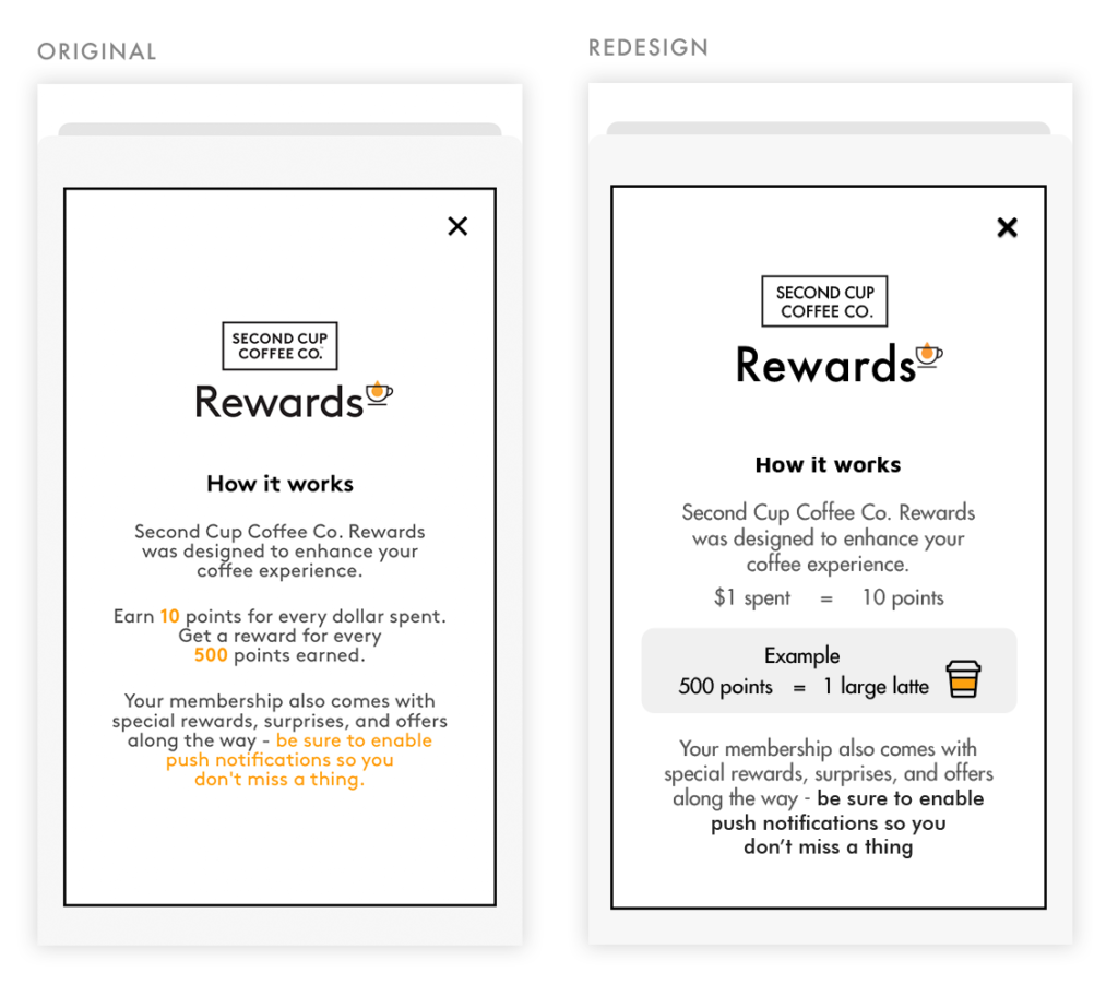
How it works
Content is reorganized to express conversions from points to actual product rewards, with emphasis on the most important parts of the explanation.
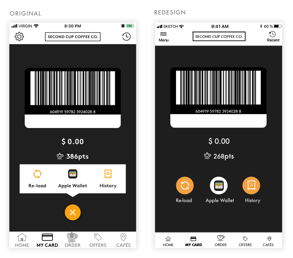
Wallet
Adhering more closely to iOS best practices, the options were turned into buttons with content shown at all times, saving the user the extra click.
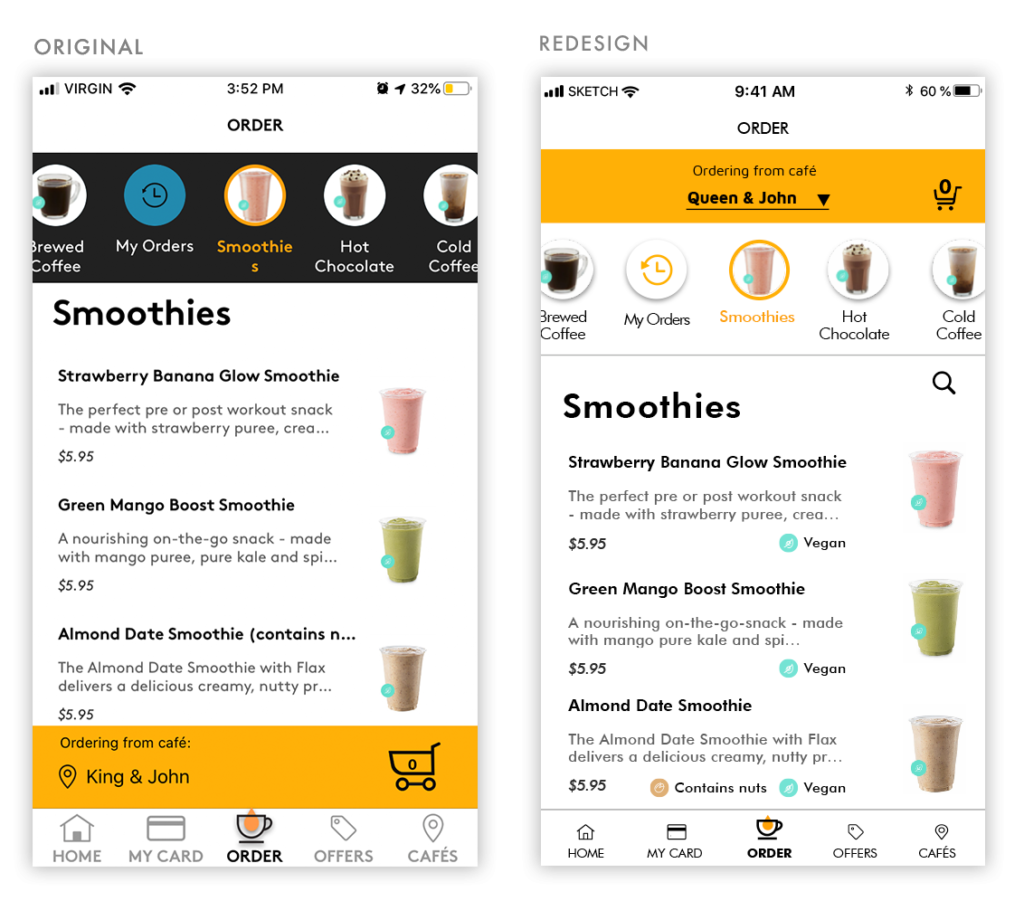
Menu
‘Pick-Up Order’ bar was moved to the top and integrated into the flow of the menu better, which can also now be changed whenever the user wants.
The menu options were made to adhere to branding colours and a search option was added, improving visibility and options available to the user.
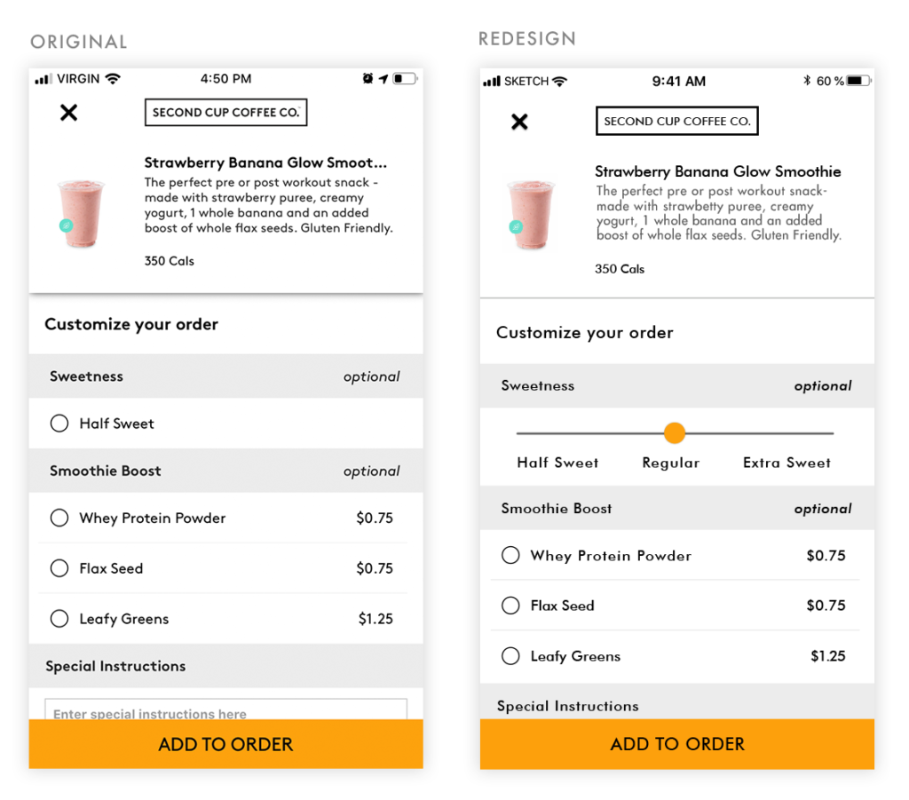
Order Customization
I created a slider to give the user more freedom to customize their drinks, instead of presenting just one more option apart from the regular one.
Add Item
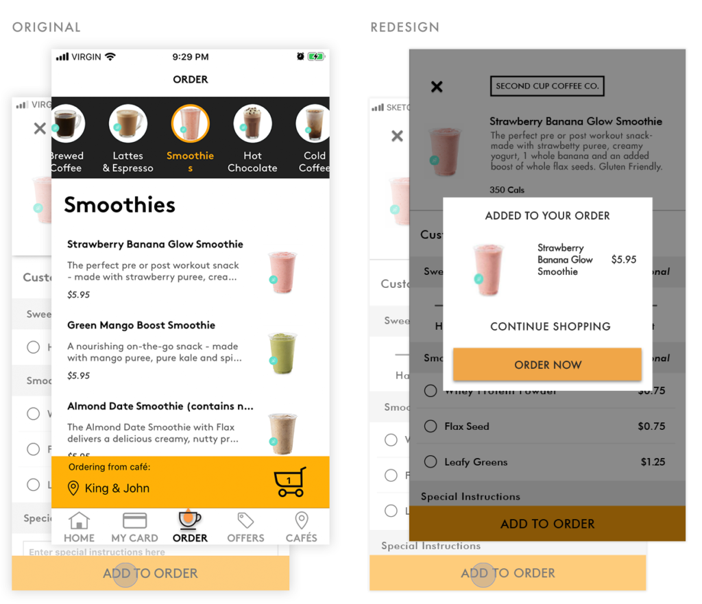
When adding items, the user was automatically taken to the order menu. Instead, a modal could be used for the user to decide if they want to continue shopping or go to the checkout.
Remove Item
Right after removing an item from the cart in the original design, users were automatically redirected to the order menu. With a modal box for confirmation, users will prevent errors by confirming the pressed choice.
Also added:
– an option to modify the pick-up location through a drop down
– the option to choose closest location first
Recover Password
After several attempts to recover a password, one of our testers gave up on the process.
We decided this was the most urgent problem to solve. Without the ability to access the app, there’s no reason for the app to exist.
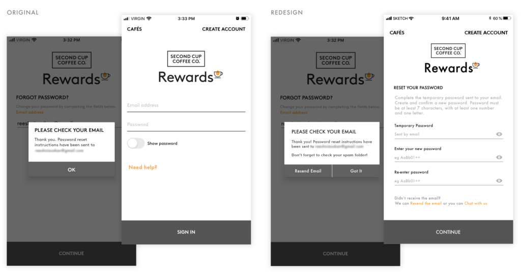
For a potential redesign, reminders to check the spam folder and an option to resend the email were created.
Then, they are left on the password reset screen. This stops them from going back to the sign-in screen, and having to start the process from zero.
Finally, if there are technical issues or any other needs they are given the option to access a representative for assistance.
System Design
User Interface Library
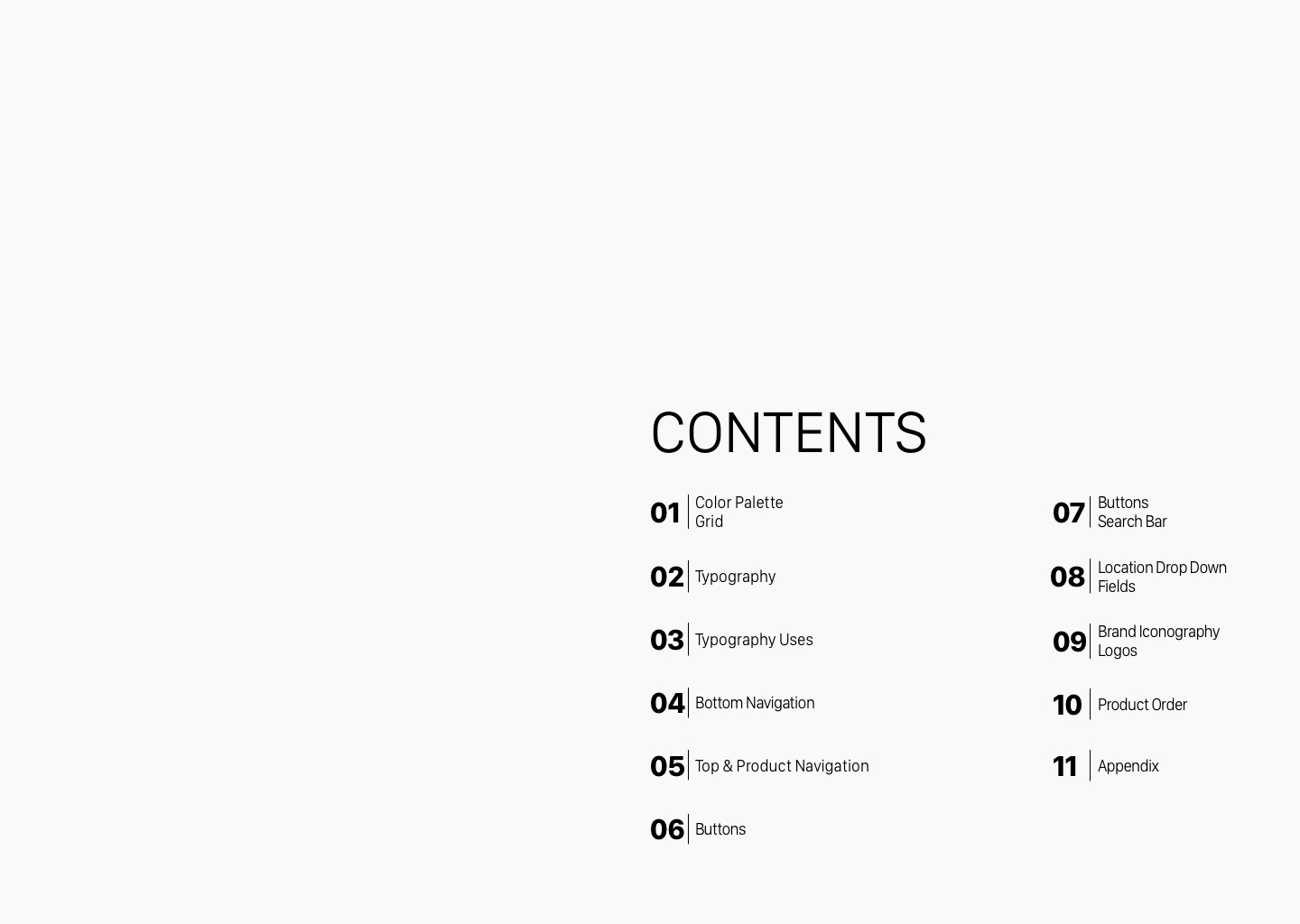
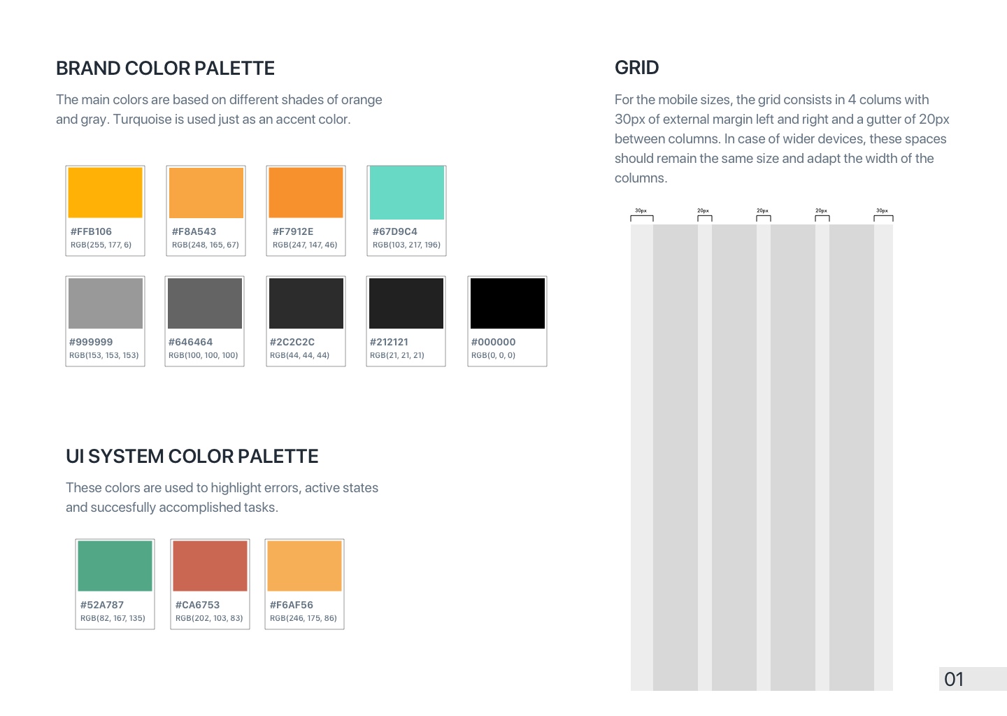
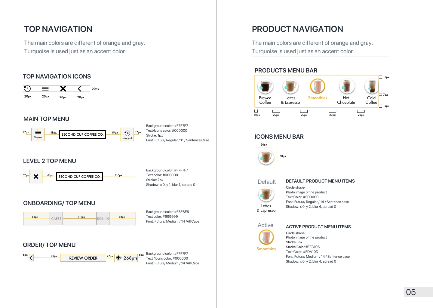
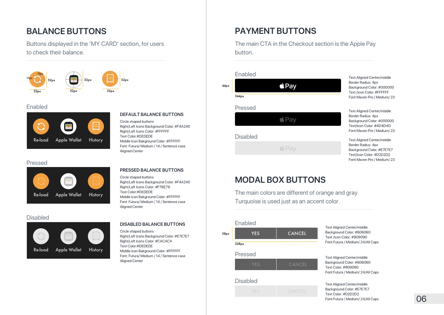
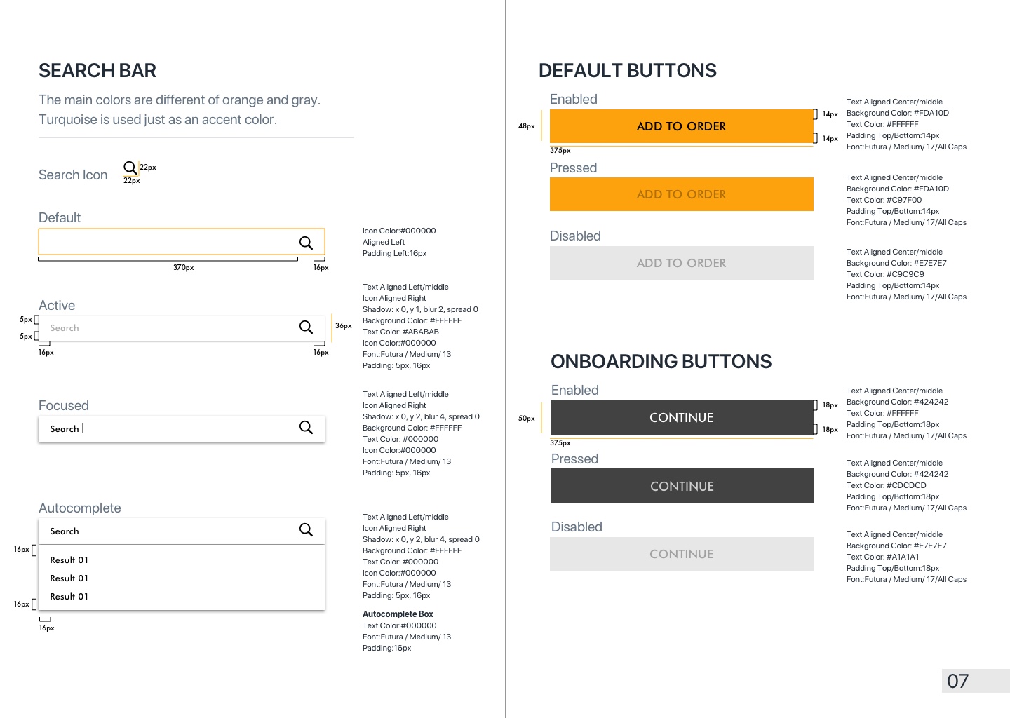
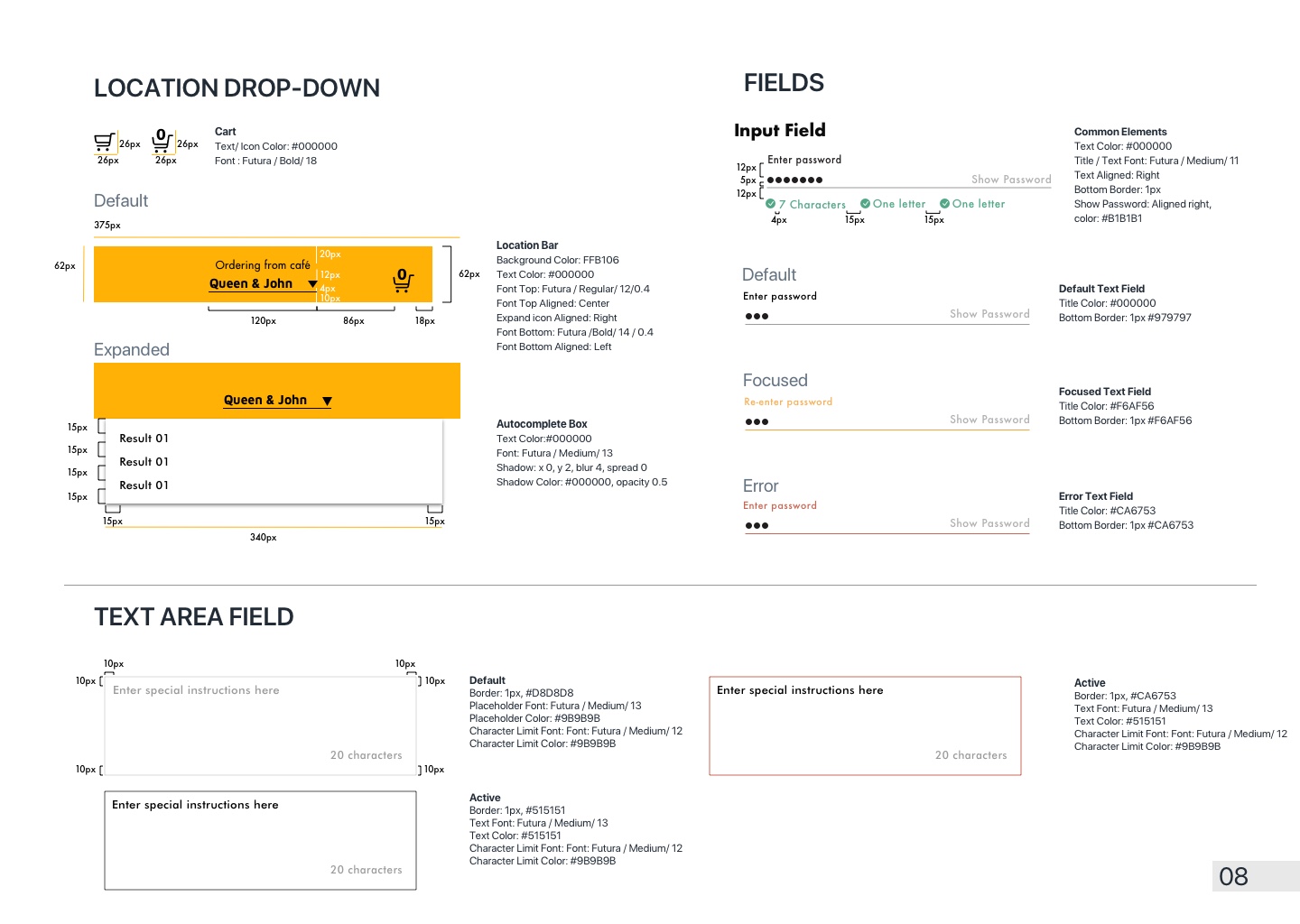
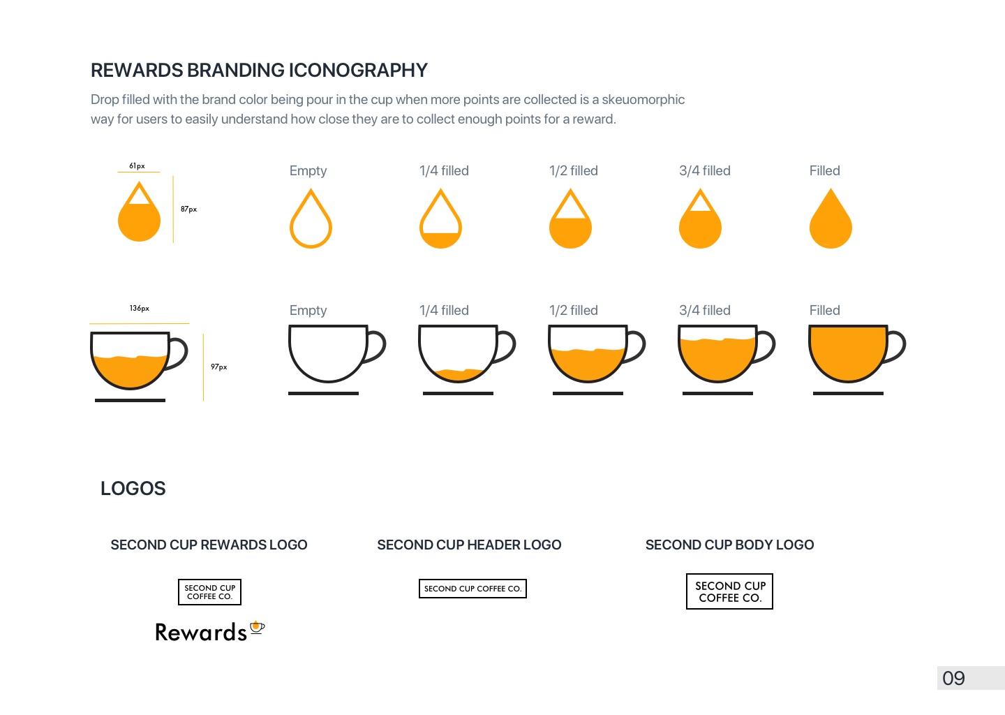
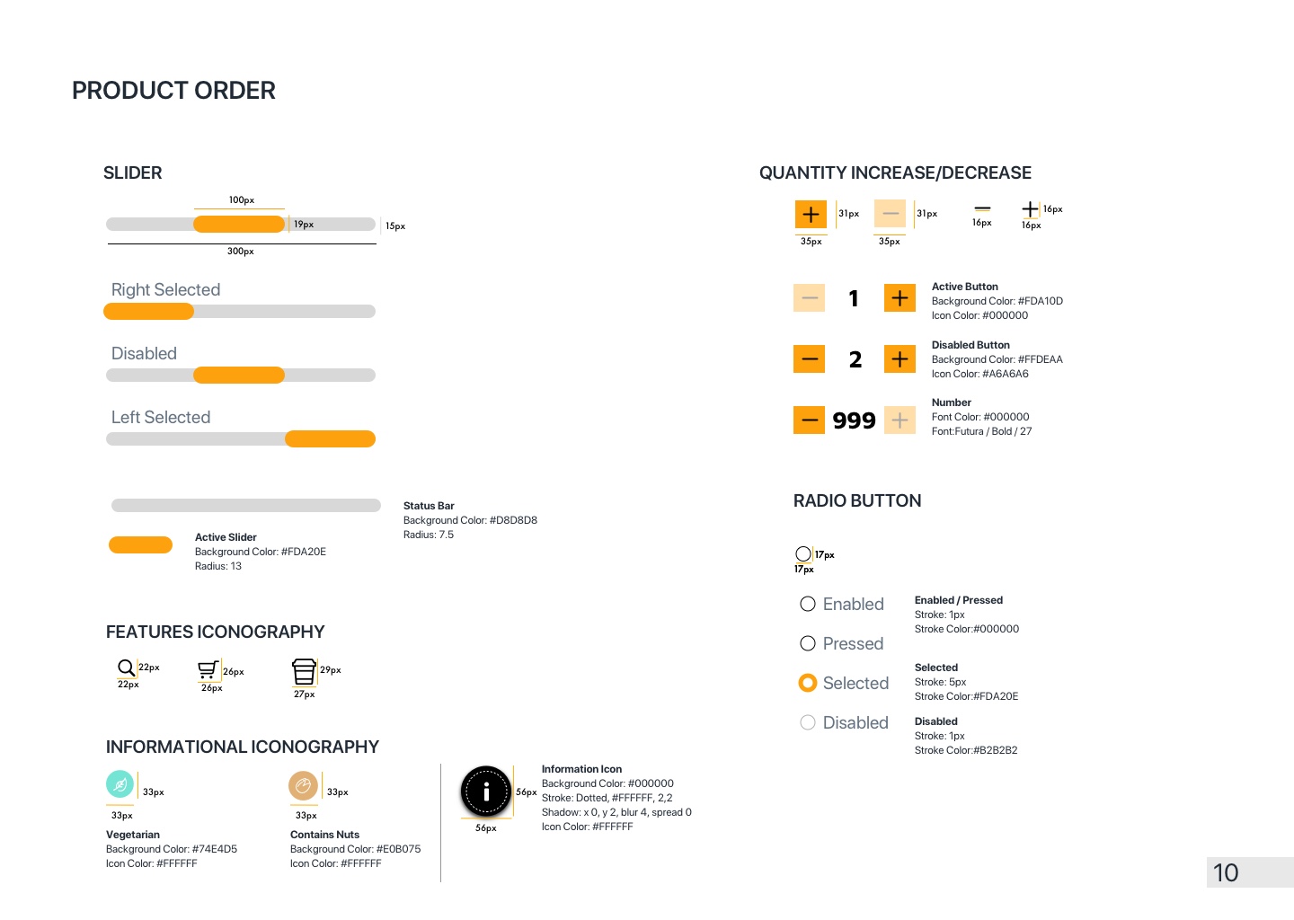
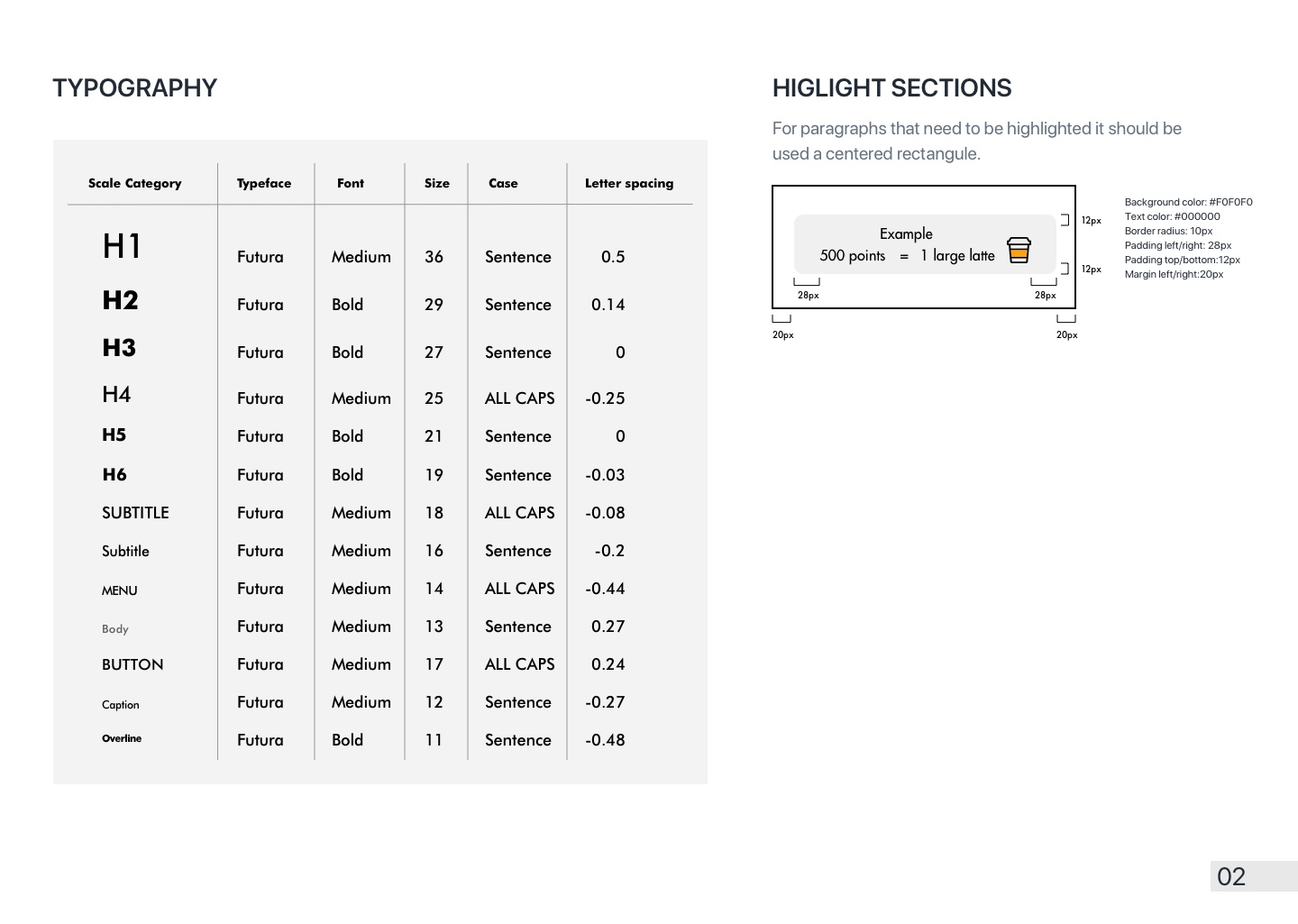
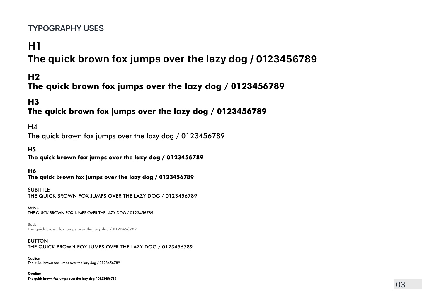
I created a clear and functional organized catalogue of all the typography, colours, components, and design elements used in my redesign. Subsequently, I turned this inventory into a functional User Interface library that can be shared with other internal departments while working in collaboration.

Further Recommendations
Based on my heuristic evaluation, the following are the usability improvements I recommend, organized according to their severity.
High Priority
- Offer a way beyond just the email address being sent once for password change or recovery.
Medium Priority
- Improve the way errors are communicated while completing registration.
- Change the use of the gear as a representation of Menu.
- Keep navigation menus consistent to iOS system standards.
Low Priority
- Integrate all informational and product menus better to reduce clutter.
- Keep the purchase items important by reducing the size of the pick-up location bar.
