
ENHANCING the interactive Delivery Report
Brand
Samsung Ads
Role
Lead Designer
Platform
Samsung DSP
Domain
Data Management


BACKGROUND
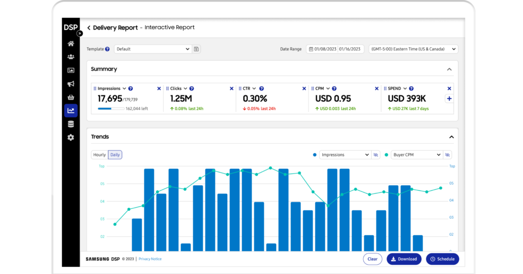
The Interactive Delivery Report is Samsung’s DSP’s key ‘Core’ report, initially powerful but with notable deficiencies.
This report plays a crucial role throughout the campaign lifecycle: it provides real-time insights for strategy optimization during the campaign and quantified sales impact post-campaign, offering essential evidence for stakeholder buy-in and future planning.
THE CHALLENGE
The main goal was to create a robust, clear and flexible way for users to access and manipulate data easily.
In order to achieve it, we evaluated the existing Delivery Report strengths and weaknesses to design an improved version.
MY INVOLVEMENT
Planning & Scope Definition
I collaborated closely with the Product Manager (PM) and Researcher to prioritize features for the report. Using heat maps and qualitative research, we determined the sequence in which capabilities would be developed and rolled out.
User Insights & Benchmarking
I worked with the PM to formulate key research questions, guiding qualitative studies to uncover major pain points and opportunities in the current solution. Additionally, I conducted competitor benchmarking to identify best practices and potential enhancements.
Design & Validation
I created multiple design iterations for the Dimensions & Metrics (D&M) table and facilitated two rounds of usability testing to refine and validate the designs.
Oversight & Coordination
As the lead designer, I coordinated with two Product Designers, a team of Engineers, and PMs to ensure that product requirements were effectively translated into actionable features within the constraints of available resources.
Testing & Iteration
I supported PMs and Researchers in conducting usability testing, analyzing results to derive actionable insights, and provided specific recommendations for design improvements based on user feedback.
SCOPE OF WORK
- End-user interviews
- Stakeholder interviews
- Quantitative analysis (Fullstory)
- Usability Testing
- Heuristics evaluation
- Benchmarking
- Prioritization
- Taxonomy definitions
- Information Architecture
- Task flows
- Wireframes
- Low/Mid/High fidelity
- Mocks
- UI prototyping
THE PROCESS
Identify Key Pain Points: Analyze and document the primary issues users encounter with the current Delivery Report to understand their frustrations and challenges.
Determine Unmet Needs: Investigate and specify the requirements that are not currently addressed by the existing report to ensure all user needs are considered.
Assess Redesign Requirements: Evaluate the necessary changes and improvements to the report based on identified pain points and unmet needs.
Recommend a Phased Redesign Process: Develop a structured plan to implement the redesign in stages, prioritizing features based on user needs to ensure a smooth transition and ongoing user satisfaction.
Consolidate Reporting Instances: Merge the Extract Delivery Report with the Interactive Report to remove redundancy, incorporating download and scheduling functionalities into the redesigned report
Interactive delivery report redesign
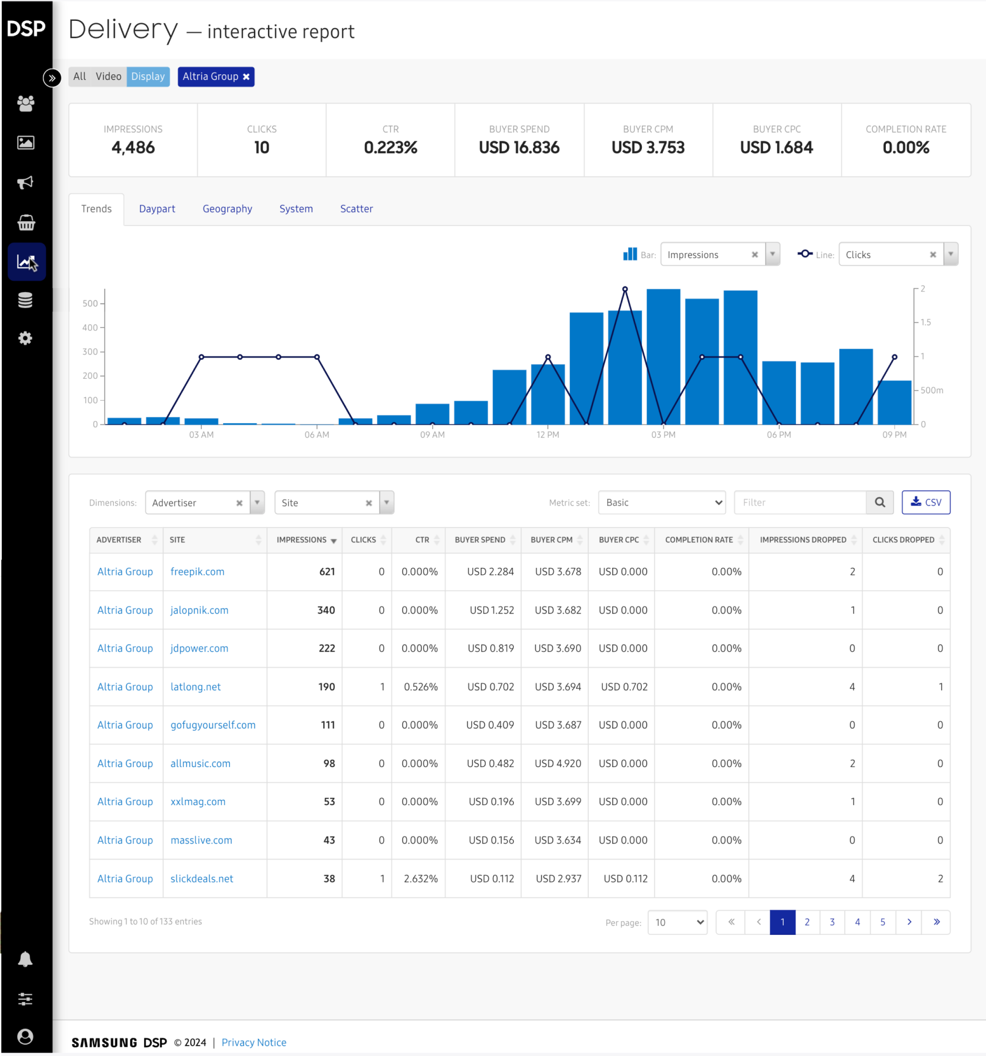
BEFORE
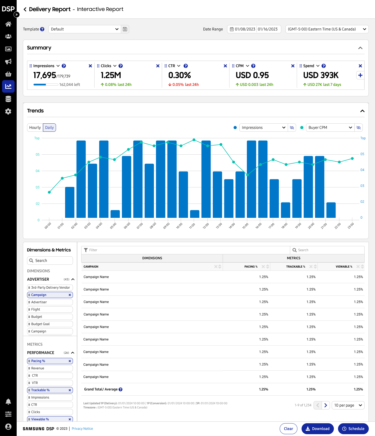
AFTER
CHALLENGES
SOLUTIONS
Static cards displaying fixed aggregated data
Customizable cards showcasing trending data
Unused chart options and limited metrics
Interactive trending charts with a wide range of metric selections
Limited dimensions & metrics selection
User-friendly interface for easy selection of dimensions and metrics
Basic, non-interactive table
Flexible and customizable table options
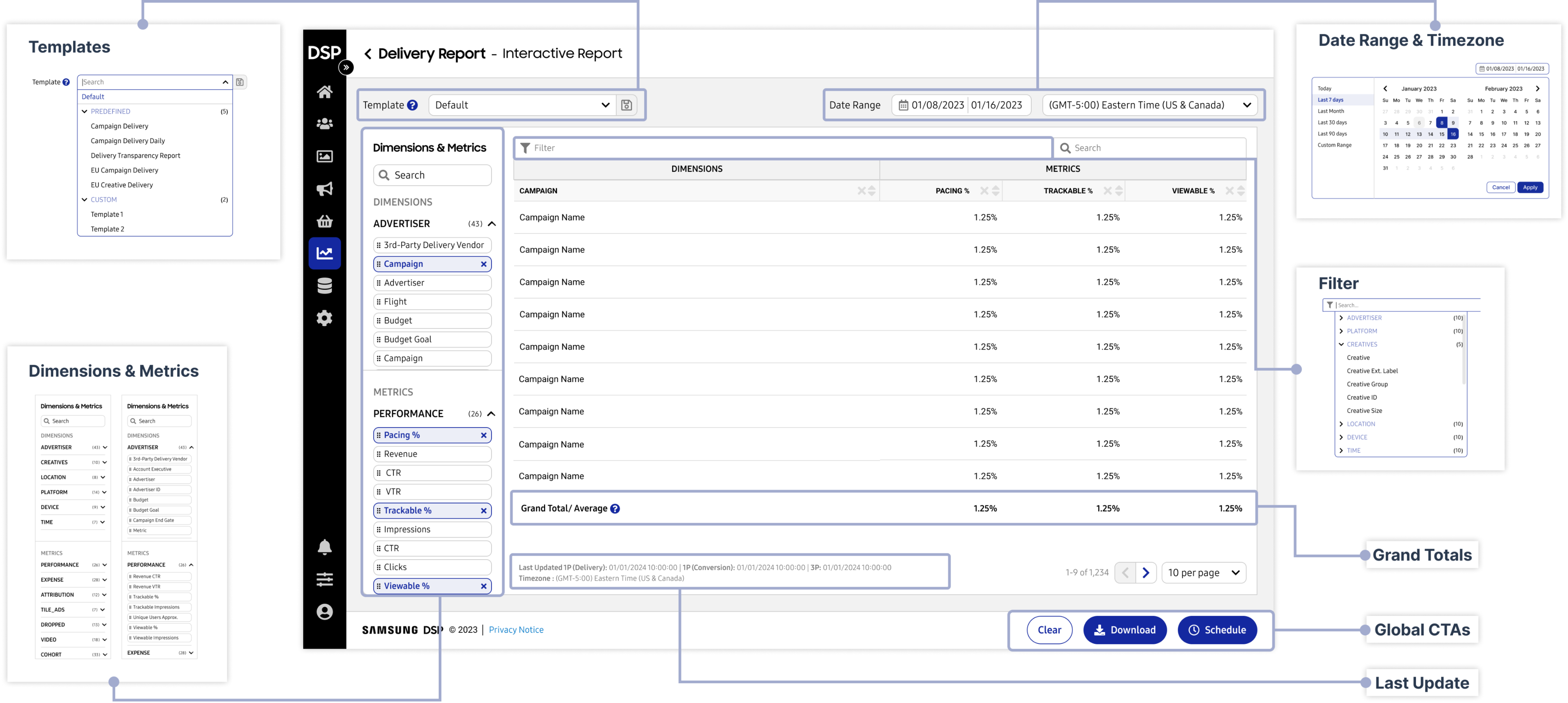
global & table improvements
(GLOBAL) CHALLENGES
SOLUTIONS
Cannot save selections for reuse
Pre-curated and custom templates
Calendar not visible in the date picker
Date picker with calendar and standard options (e.g., last 7 days)
No timezone display
Timezone display with the option to adjust
Downloads restricted to .csv only
Multiple download formats and scheduling options
(TABLE) CHALLENGES
SOLUTIONS
Hard to find Dimensions & Metrics
Categorization and search functionality for Dimensions & Metrics
Limited selection of Dimensions & Metrics (2)
Unlimited selection of Dimensions & Metrics
Confusing filtering from multiple entry points
Confusing filtering from multiple entry points
No grand totals or averages
Displays grand totals and averages
Uncertainty about data freshness
Indicates last data update (1st and 3rd Party)
table building Workflow
EMPTY TABLE
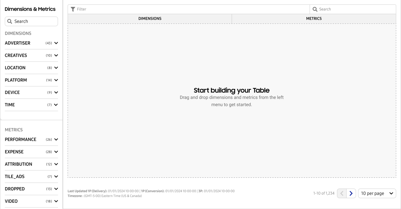
Dimensions and Metrics are categorized for easy discovery and collapsed by default. The main interface guides users through table creation.
Dimension Selection
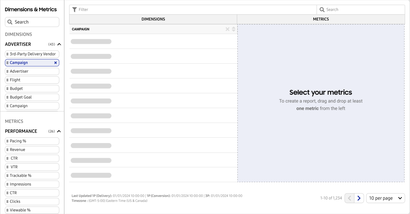
To display data, users must select at least one dimension and one metric. We guide them through the selection process for ease of use.
Metric Selection (drag & drop)
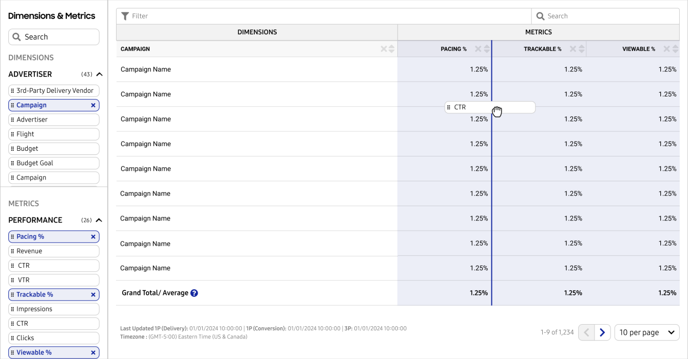
When users click a Dimension or Metric, it adds a column to the table. Dragging and dropping allows for further customization.
table (flexible customization)
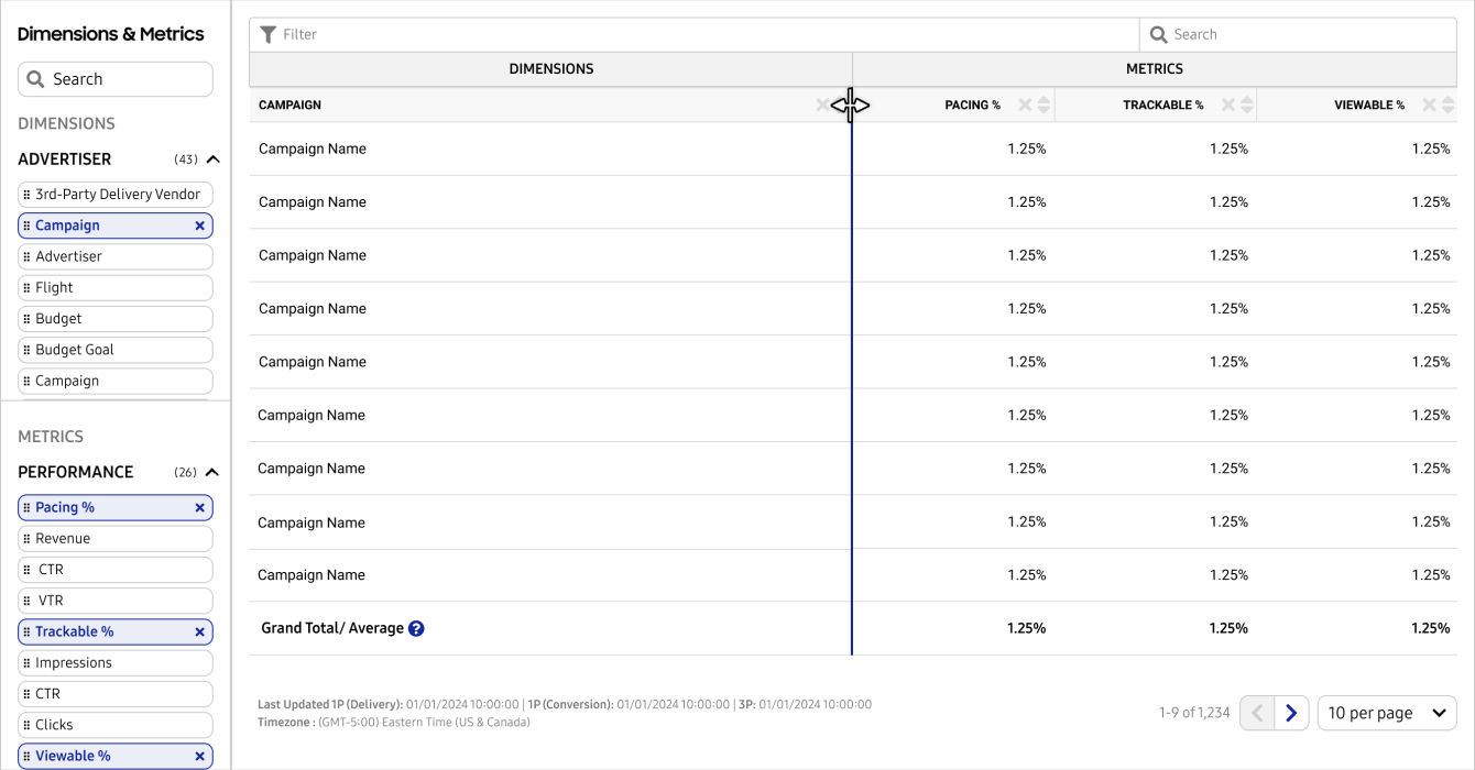
The table allows users to resize, reorder, or remove columns easily.
THE RESULTS
By consolidating the extract, legacy, and interactive delivery reports into a single unified report, we eliminated the fragmented workflow that previously required users to navigate multiple sections for necessary data. This streamlined approach resulted in several key improvements:
Increased Report Adoption: A significant rise in report adoption due to the introduction of nearly 250 options for dimensions and metrics, addressing new personas’ needs.
Improved Task Efficiency: A notable reduction in the time required to create and download reports, as we introduced the ability to save and reuse templates.
Reduced Support Ticket Volume: A marked decrease in support tickets to the Analytics Team, indicating the new features effectively addressed user needs.
Enhanced Customization and Flexibility: Users now have the ability to customize dimension and metric combinations, save configurations, and export data based on their specific needs, improving overall functionality.
